Build journal · Part 1
Three weeks of a travel journal app, in screenshots
From color-block wireframes to handwritten Polaroids. Every detour, every "oh that's actually it" moment, in roughly the order they happened.
A quick preface before the screenshots. This whole project started in an airport. I was waiting on a connection home from Roatán earlier this spring when a friend pulled out her iPad and showed me the travel journal she'd made of our week there — Polaroids at angles, handwritten captions, little doodled arrows pointing at the things that mattered. A week of memories on a few pages. I asked how she'd made it. "By hand," she said. "Three nights." I sat with that through the layover and the cab home, and by the time I unlocked my front door I had a feature list.
Three weeks of building later, I've ended up with hundreds of screenshots — most of them forgettable iterations on a single layout that I tweaked, screenshotted, hated, tweaked again. But strung together, they tell a real story: the version of the app I started with looks almost nothing like the one running on my desk right now.
I wanted a record of how it actually went — not the polished "here's the launch" version, but the messy middle. So here's the build, in roughly twelve images.
Day 1 · April 11The wireframe phase
This is where it started. A sidebar with four tabs (Journal Home, Map View, Gallery, Calibration — that last one is a relic I've since killed), a hero image at the top, and a grid of memory cards underneath in flat, swatch-y colors.
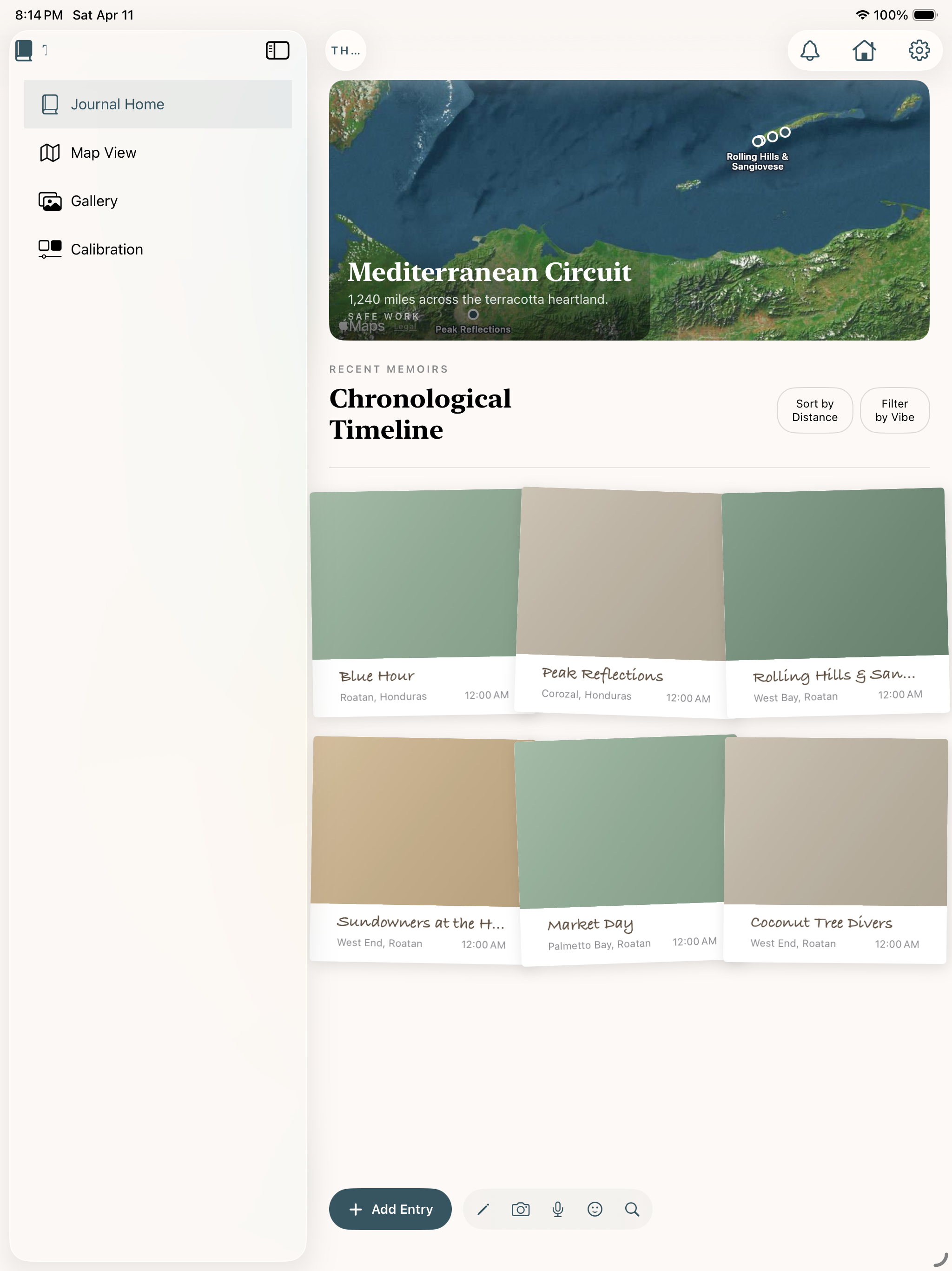
The thing is, I knew it was wrong the moment I saw it. A travel journal that looks this neat is missing the point — the whole reason to journal a trip is that the trip wasn't neat. Tape, paperclips, half-stuck postcards. That's the texture I wanted.
But I left it alone for the first day, because the architecture was right even if the surface was off. Cards. Detail views. Sidebar nav. Get the bones standing first.
Day 3 · April 13Real photos make everything different
Two days in, I dropped a real photo into the home screen and the entire feel of the app changed in five seconds. Suddenly the empty journey card below felt like a placeholder for a memory, not a placeholder for a feature.
Two things I didn't expect to learn from this screen:
The app needs to look mostly empty. Travel journaling is a slow practice, and the UI shouldn't make a single trip feel lonely. It should make it feel like the start of a shelf.
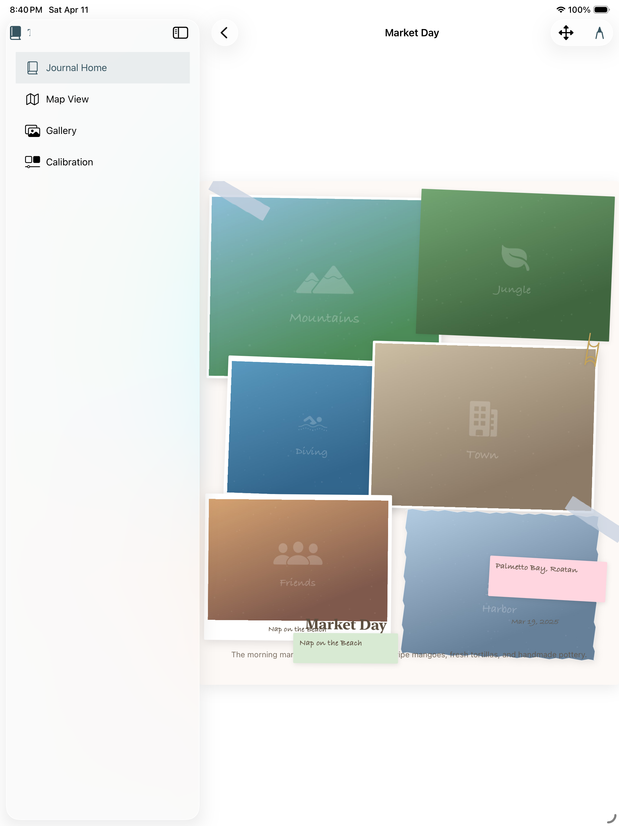
Days 4–5 · April 14–15The pivot: scrapbook, not gallery
This is the part where the app stopped being a generic photo grid and started being itself. I spent a long evening on April 14 and a longer one on April 15 redoing the entry detail screen as a freeform scrapbook page — Polaroids at angles, washi tape, sticky notes, hand-drawn arrows, the works.
The first attempt was rough. Photos were placeholder gradients, the captions said "Memory 1, Memory 2, Memory 3," and I literally titled the page "Uh oh" because the layout engine kept eating my arrangements:
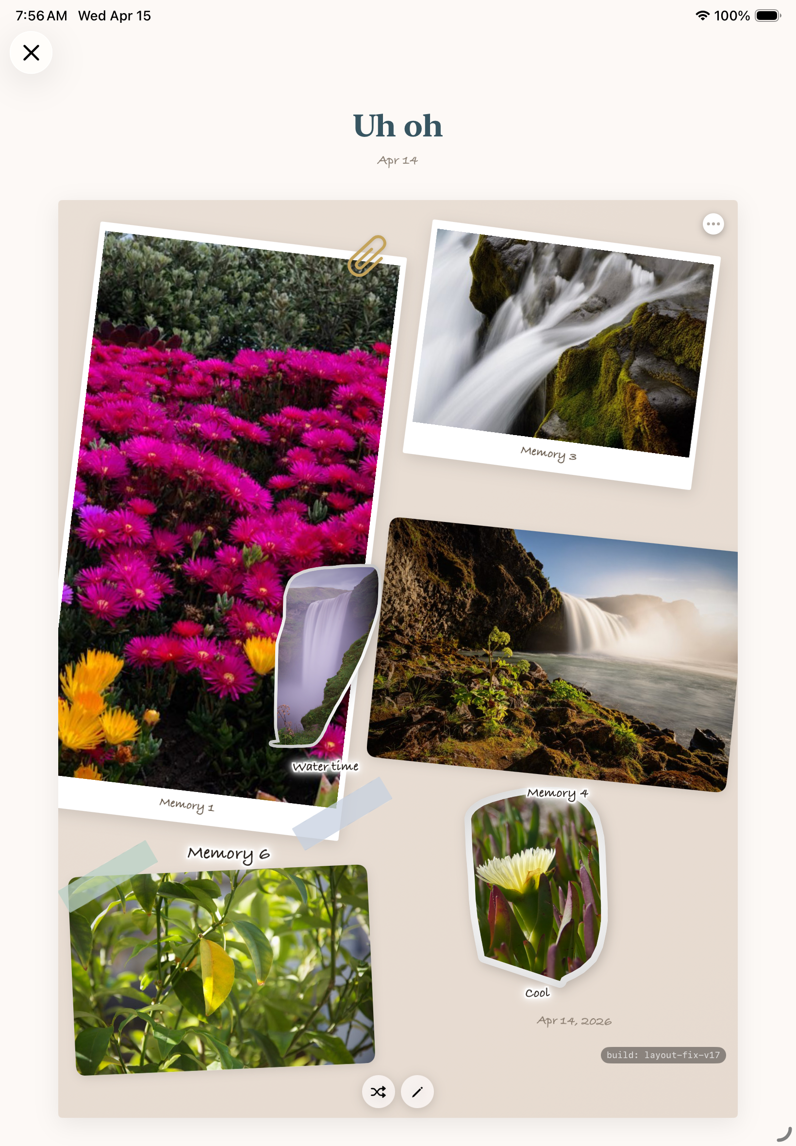
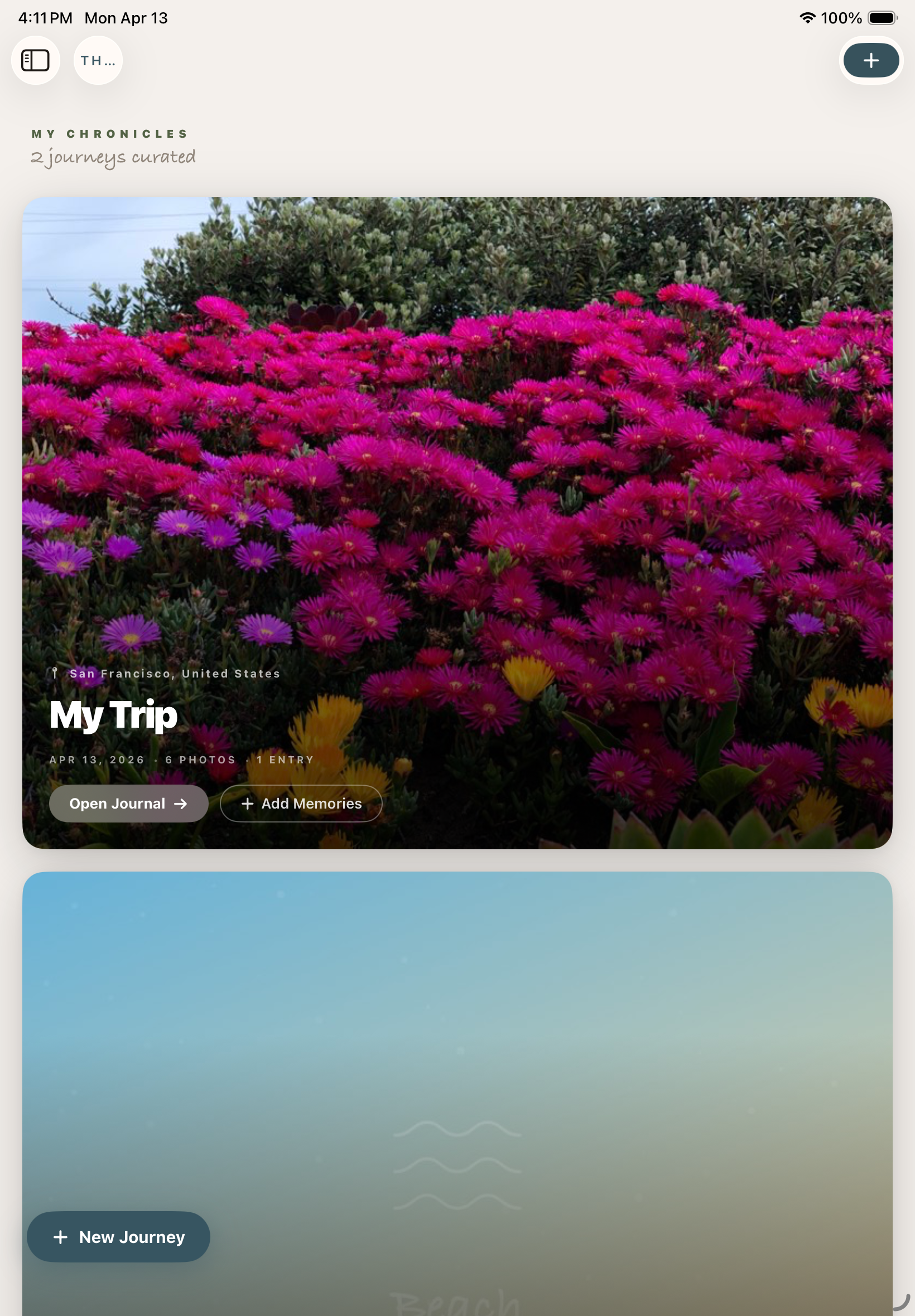
By the next afternoon I had it building real pages. I dropped in a handful of photos from a walk I'd taken — flowers, a waterfall, a water lily — and let the layout engine arrange them. Sticky-note "memory" labels, a hand-drawn arrow, a location tag at the bottom, the whole vocabulary working together for the first time. It was the first time the app produced a screen that felt like something I'd actually keep.
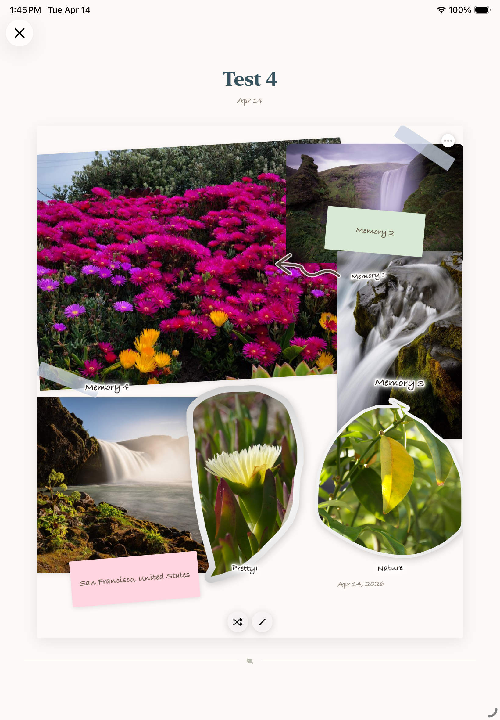
"This was the moment I stopped questioning whether the app should exist."
Day 12 · April 22Real trip data lands
Up until this point everything was synthetic. I'd been building with placeholder photos, fake captions, generated city names. Then I dropped in a real folder — my Kyoto trip from last fall — and the app finally got tested by something it hadn't been tuned to.
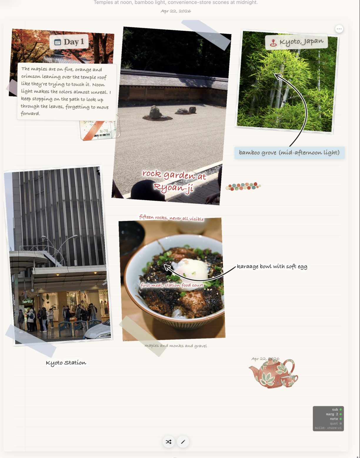
What I learned dropping real data in:
Photos almost never want to be the same size. The grid I'd built two weeks earlier assumed they would. Half the layout work over the next few days was just letting the page breathe — letting one photo dominate, letting another shrink to a stamp.
Captions are the journal. Not the photos. The photos are the prompt; the caption is the thing you'll come back to in five years and recognize yourself in. I started giving the caption block much more room.
Day 17 · April 27The middle slog
I don't have a single hero shot for this stretch — just a wall of nearly-identical iterations on the same Kyoto page, each one nudging a card a few points, swapping a font, adding shadow, removing shadow. Most of them aren't worth showing. But this one is, because it captures what most of the build actually looks like:
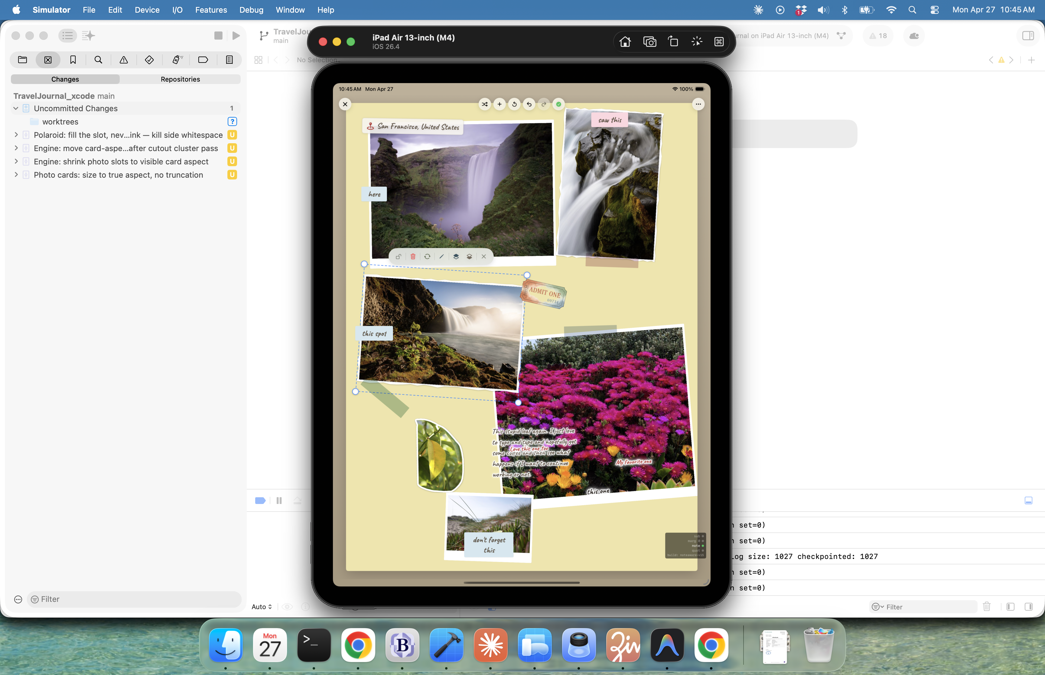
The only useful thing I'll say about this stretch is that I started keeping a notes doc with one rule: every change had to make the app feel different, not just look different. Anything that only looked different got reverted. That cut the iterations roughly in half.
Day 19 · April 29It starts looking like itself
Around the 29th something clicked. Probably just compounding small fixes — better default angles for taped photos, tighter sticky-note typography, the caption block finally having the right margin — but the pages started looking like things I would have made on paper.
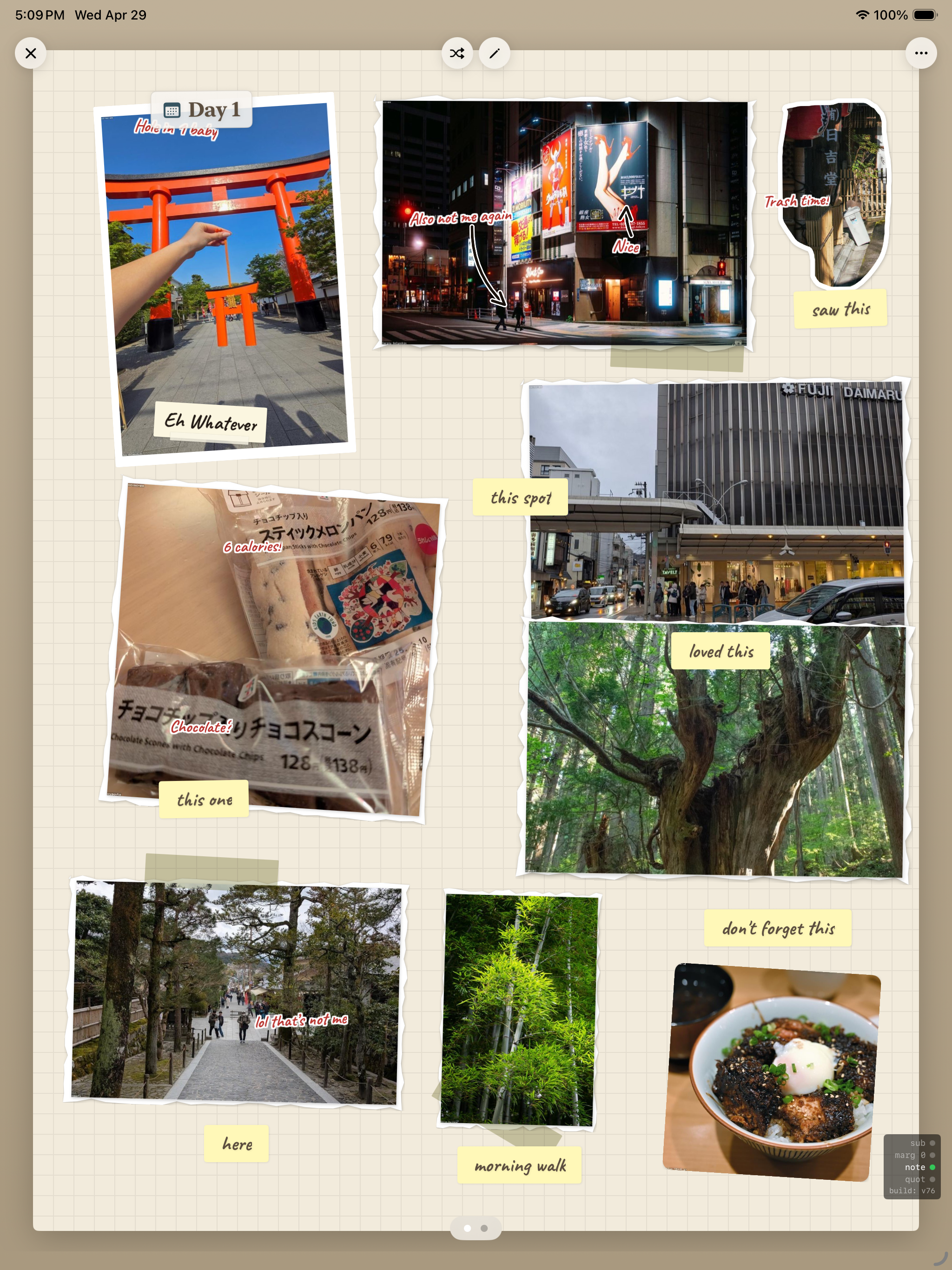
I sent this screenshot to two friends. The first one asked what trip it was. The second one asked what app it was. That was, in a small way, the proof I'd been waiting for.
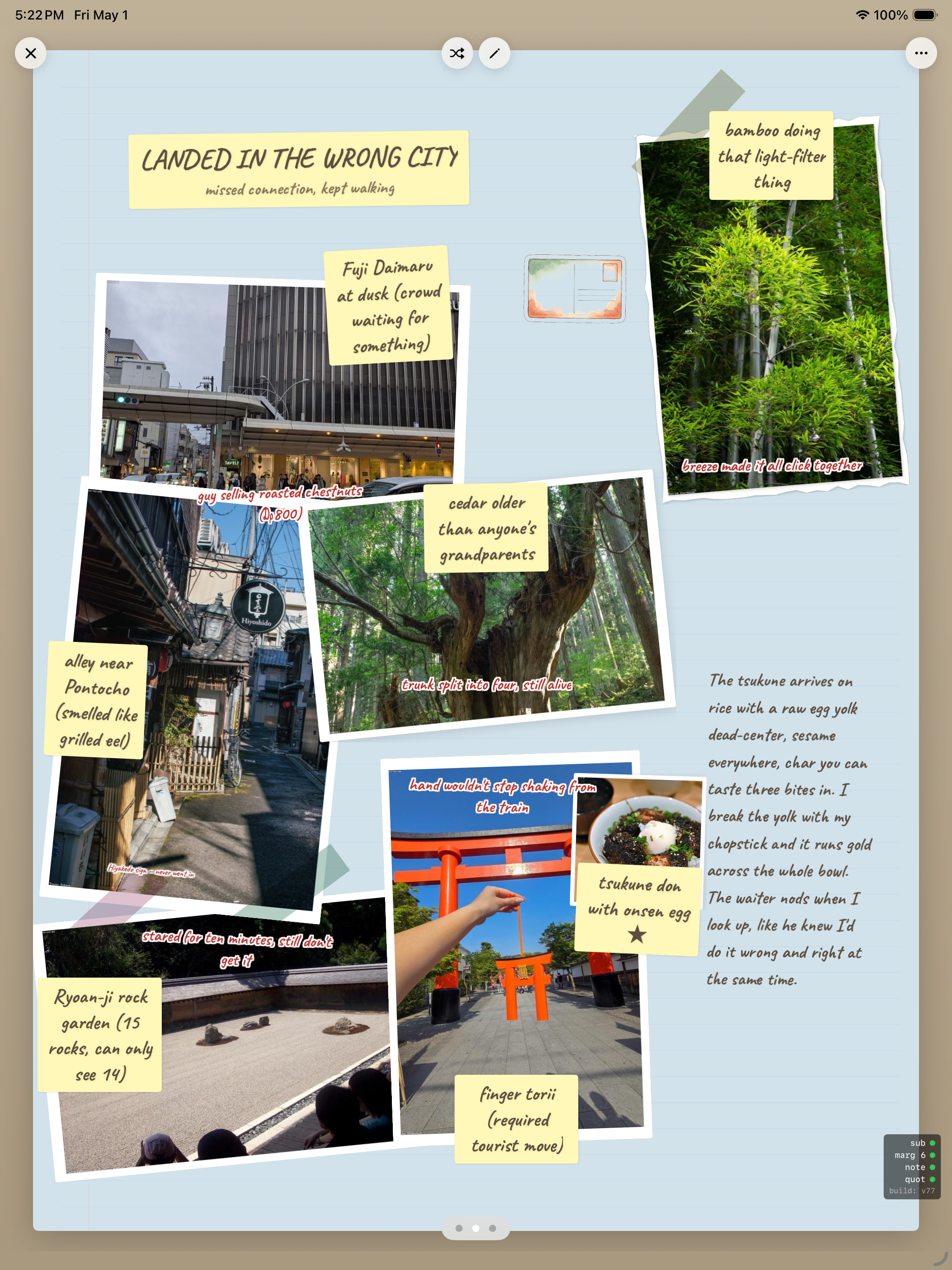
Day 21 · May 1Where it lives now
Last night I built an entry I actually wanted to make — a real anecdote, not just a layout test. Title: Landed in the Wrong City. Subtitle: "missed connection, kept waiting." The kind of trip story you'd tell someone over dinner.
Things I didn't have on April 11 that I have now:
A real layout engine that respects photo aspect ratios. Sticky-note typography that looks handwritten without looking fake. A caption block that scales gracefully from one line to three paragraphs. A vocabulary of "decorations" — tape, paperclips, illustrated stickers — that I can place programmatically. And, finally, the conviction that the app is doing one specific thing well, instead of trying to be a generic journal with travel features bolted on.
What's next
The map view is still the placeholder I drew on day one. The collaboration tab needs an actual reason to exist or it needs to die. The export-to-PDF flow is held together with hope. The iPhone layout doesn't exist.
But if I had to ship the app on Monday, I think I could. Three weeks ago that wasn't even close to true.
If you're starting an app and you're tempted to skip the screenshot habit because it feels self-indulgent — don't. I've learned more from putting these twelve images in chronological order than I learned from any single one of them on the day I took it. The shape of the build only shows up in the rearview.