Mementoir home · Part 1: April 11 – May 1

Build journal · Part 2

Polish, naming, ship

Three weeks of late nights, a portmanteau, an AI feature, and a Submit button. The part of the build where the app stopped being mine and started being a product.

At the end of Part 1, I wrote: "if I had to ship the app on Monday, I think I could."

Reader: I could not.

The next three weeks were the part of the build I'd been quietly dreading — the part where "looks good on my desk" turns into "actually exists in the world." Onboarding. Naming. A monetization story. App Store screenshots. An About page. The hundred small panics that come with attaching your name to a thing strangers can download.

Twenty-one days, another hundred-or-so screenshots, and one Submit for Review tap later, here's how it went.


Day 22 · May 2Real entries, on real phones

Part 1 ended on the iPad. The next morning I started building the iPhone layout, because every test reader I'd shown the iPad version to had said some version of "this looks great, but I don't carry my iPad on trips."

It turns out the scrapbook layout I'd spent three weeks tuning for a 13-inch canvas doesn't just shrink. It had to be rethought from the photo-stacking outward. Two days of work, this is roughly where it landed:

iPhone 17 Pro simulator showing a Mementoir journal entry titled Day 1 First Day on the Island West End Roatán, with overlapping Polaroid-style photos of food, streets, and scenes including labels like Fried Plane Soft Shell, Wrapped Snapper, Empanadas de Yuca, Best Baleada, 15$ lobster special, Cabbi, BBQ Wings, Pura Vida, and a small Easter egg sticker
May 2, 10:44 PM. First iPhone journal that actually held together — "Day 1 · First Day on the Island, West End Roatán." Same photo-arrangement engine as the iPad, but with a much tighter aspect ratio. Half the photos got smaller, half got rotated more aggressively, and a single column took over from the freeform grid. The little Easter egg sticker in the middle was an accident I left in.

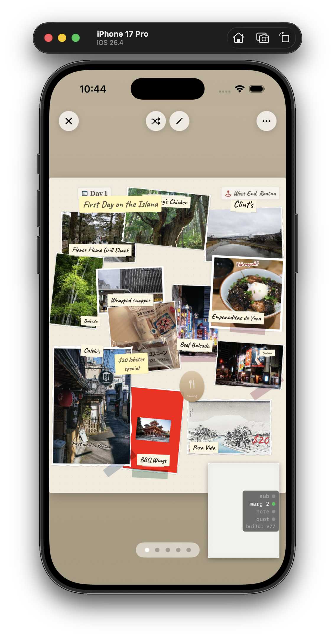
"Roatán" turned out to be a recurring word over the next few weeks. More on that.

Day 22 · May 2The 5 AM era

There's a stretch of about ten days in the middle of May where almost every screenshot in my folder is timestamped between 4 AM and 6 AM. I don't recommend this as a way to live, but I do recommend looking at the kind of work it produces — because almost none of it is the kind of work you'd do in daylight, when an adult might wander past.

The clearest snapshot I have of the era is this one, captured on the iPad simulator at 6:41 AM on a Saturday, after what I'm fairly sure was a five-hour stretch of moving captions a few points at a time:

iPad Air 13-inch simulator at 6:41 AM Saturday May 2 showing a Mementoir journal page titled PINK PETALS AND CONVENIENCE STORES, Day 1, with location chip San Francisco United States and subtitle blossoms, bridges, melon bread. The page has multiple Polaroid-style photos arranged on a tan canvas: a sloping forest path labeled temple approach moss on everything, a melon bread and chocolate scone with caption melon bread and chocolate scone Lawson haul, a corner storefront after dark labeled corner billboard glow after dark, a snowy ukiyo-e postcard labeled ukiyo-e postcard 500 yen at museum shop, a bright neon Shinjuku street labeled Shinjuku neon or close enough, a riverbank cherry tree in full bloom labeled riverbank cherry trees full bloom, and an overcast river photo labeled overcast river walk no tourists. A small yellow note reads walked this twice, second time in drizzle. Down the left side runs a handwritten prose block: Trees just past the footbridge, petals drifting onto the gravel path like confetti nobody asked for. The air smells faintly of cut grass and something sweet I can't name. A cyclist rings past. I stand under the widest branch and tilt my phone up, trying to catch the light through the blossoms. It's the kind of quiet that makes you forget you're still in a city.
May 2, 6:41 AM. "PINK PETALS & CONVENIENCE STORES · blossoms, bridges, melon bread." Day 1 of a different trip than the one Part 1 closed on — same engine, very different feel. Short captions ("temple approach (moss on everything)"), medium captions ("riverbank cherry trees, full bloom"), and a full prose block down the left side, all sitting on the same page without elbowing each other.

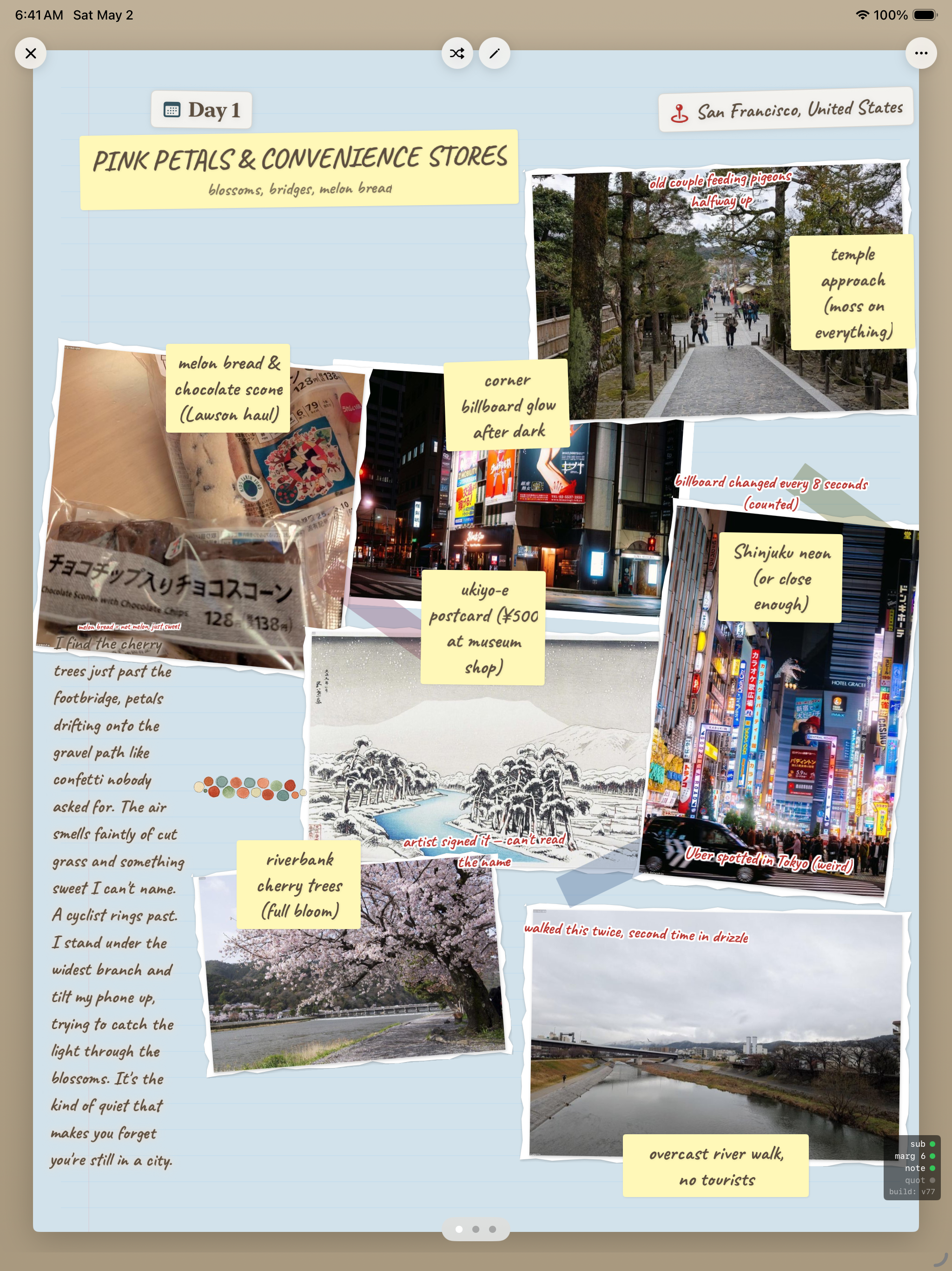
The reason this page took until 6:41 AM is the long block of text on the left. Up until this morning, the engine could handle short captions and it could handle photos, but anything longer than a sentence tended to bully its neighbors — pushing photos out of frame, breaking the masonry, leaving dead zones at the bottom of the page. I'd been tuning the wrap thresholds and the column reservation logic for two days, and somewhere around 5 AM something finally clicked: the long-prose block had to claim its column up-front, not get added to the layout after the photos were already placed.

I don't have a screenshot of the moment the fix worked. The closest I have is this one, captured a few minutes later — me reading the result and quietly forgetting to take a screenshot of anything except the finished page.

That's most of what the 5 AM era was: hours of moving thresholds by 0.02, capped by ten minutes of a page that finally read like a page. Then sleep.

"The 5 AM era was, in retrospect, where the app's actual personality got finalized."

Day 31 · May 11Naming the thing

I'd been calling it "travel journal" in my head for a month. At some point you have to put a real name on the App Store form, and "travel journal" is not a name, it's a category.

I asked for portmanteau suggestions. I got a list:

Document listing portmanteau name suggestions for the app, organized by angle: Story plus journal (Anecdiary, Mementoir, Storyfold), Travel plus page (Trippet, Wandertale, Roamleaf), Craft plus page (Pagewright, Inkfold), Charm plus travel (Jauntique, Charmlog). Mementoir is highlighted. Top 3 picks listed: Anecdiary, Mementoir, Pagewright.
May 11, 3:56 PM. Memento + memoir. The note next to it: "most elegant, sounds like a real brand. Slight risk of 'what does that mean?' but it pays off once explained." I sat on this for three days, kept asking friends to say it back to me, and on May 14 I bought the domain.

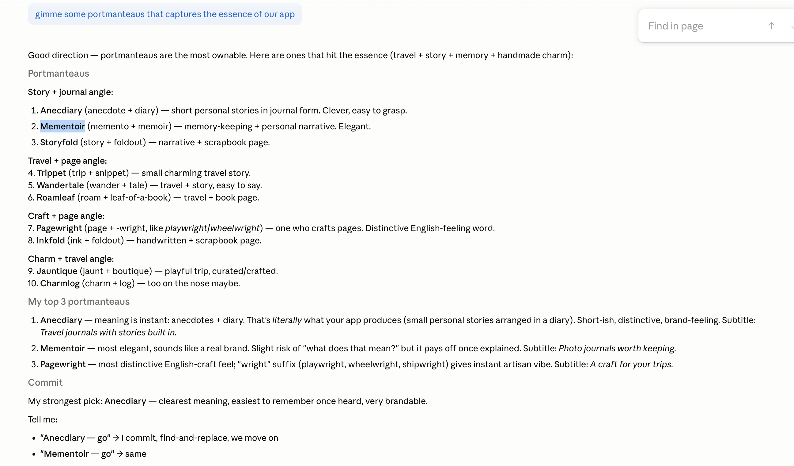
What I learned from naming an app, condensed: the best name is the one you can still type without flinching after the hundredth time you say it out loud. Most candidates fail this test within an hour. Mementoir didn't.

Day 36 · May 16The Magic Wizard

This was the biggest feature added in the entire month, and it almost didn't make it in.

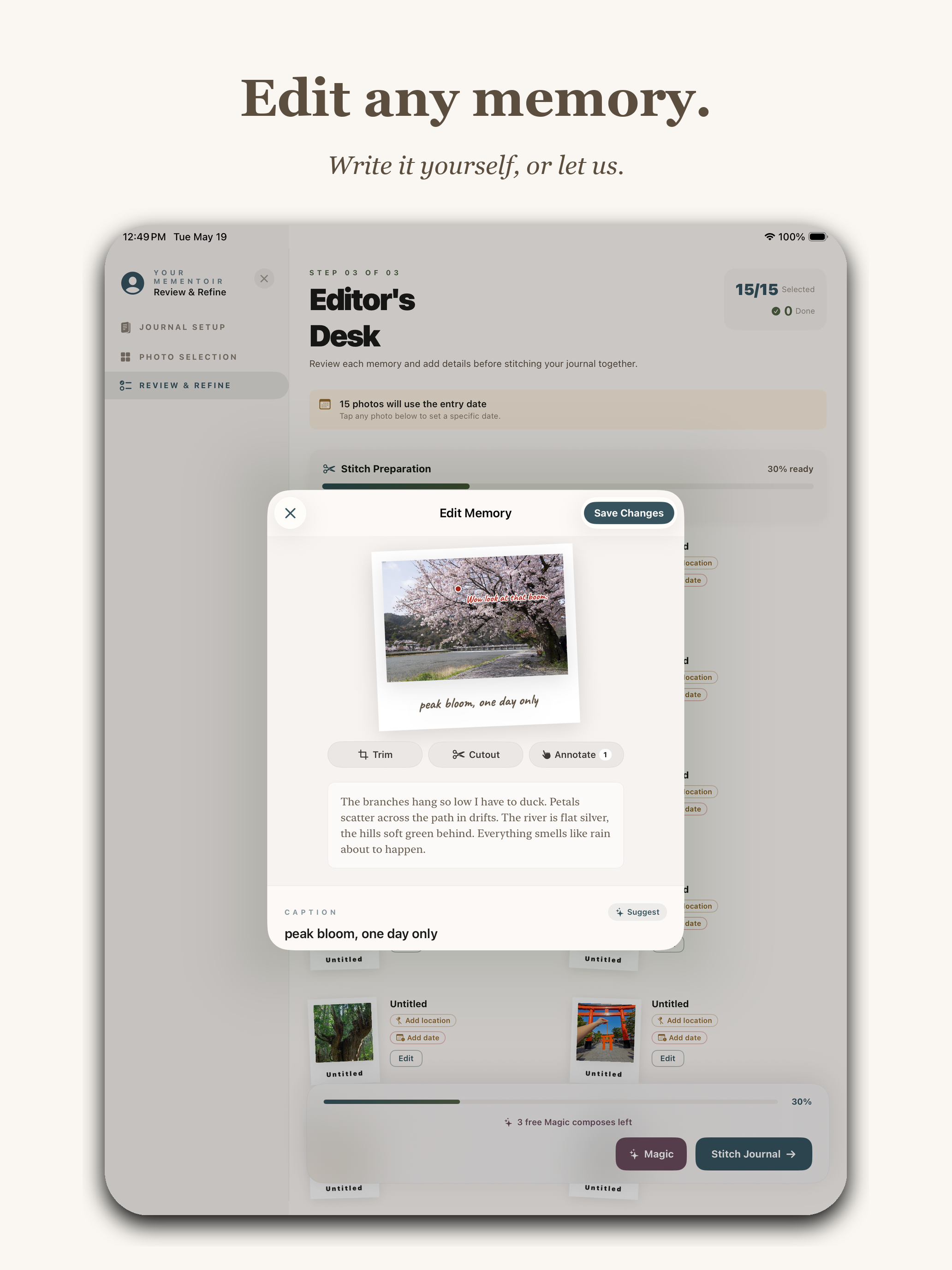
The complaint that kept coming back from test users was the same one I'd had myself the first time I'd seen a beautiful travel journal: I could never make that. Composition on a blank page is intimidating. Most people don't want to fight a layout engine; they want a layout to show up already half-done.

So I built a thing the app calls the Magic Wizard. You pick photos, you tell it the trip name and dates, and it stitches a draft journal — captions, layouts, locations, the works — that you then refine. The user-facing verb is "stitch," which I'm proud of.

Mementoir Editor's Desk Review and Refine screen with sidebar steps Journal Setup, Photo Selection, Review and Refine. Header reads Editor's Desk with 10 of 10 photos and 1 entry. A Stitch Preparation progress bar shows 37 percent ready. A modal popup reads Working the magic — Writing the captions, laying out the pages. This can take a minute or two — please keep the app open. Bottom shows 1 free Magic compose left and a Stitch Journal button.
App Store screenshot, "Magic, working." Subtitle: Captions, layouts, and arrows — in seconds. The Wizard mid-stitch — 10 photos in, 1 entry being composed, "Working the magic" modal up, progress bar at 37%. The "1 free Magic compose left" badge at the bottom is the subscription model in three words. (More on the subscription in a minute.)

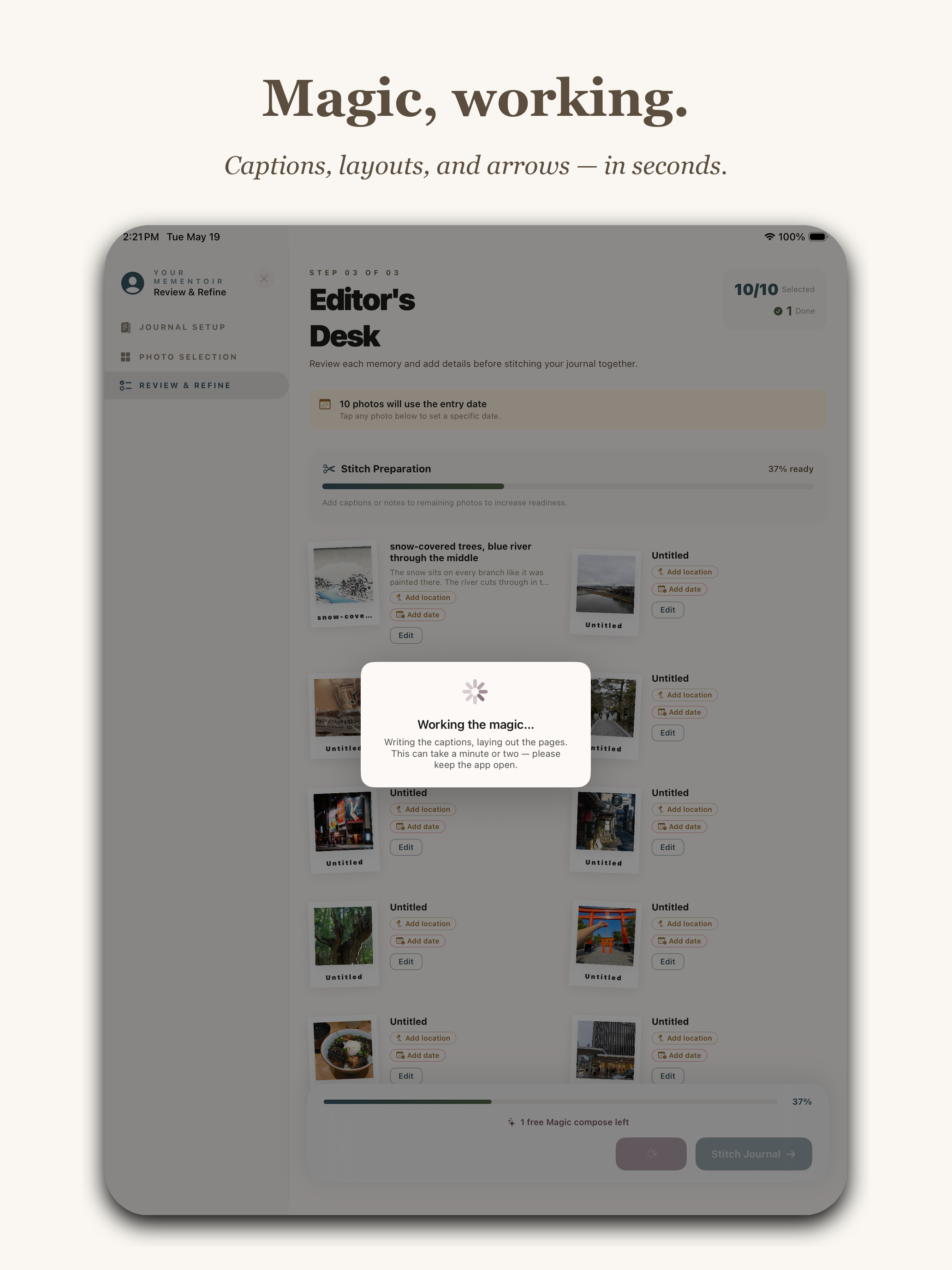
I shipped a basic version on May 14, then spent the next four days re-doing it twice. The first version made captions that were too verbose. The second made them too clipped. The third was the one — captions in the right voice ("morning walk," "saw this," "loved this"), arrows in the right places, photos sized like a person who knows what they're doing would size them.

Days 39–42 · May 19–22The About page (the one that almost made me not ship)

I wrote the App Store description, the keywords, the support URL, the privacy policy. Boring. Then I sat down to write the in-app About page and I couldn't do it for three hours.

The problem was that I had to admit, in print, what the app actually was — not the feature list version, but the why-does-this-exist version. The first draft on May 19 was three short paragraphs and a Roatán airport. I revised it on May 22, the morning of submission, when I realized the version on disk was still missing the moment that actually convinced me the app should exist:

iPhone simulator showing the Mementoir About page titled How Mementoir began with small decorative stamps and a green washi tape highlight at the top. The body reads: I was at the airport coming back from Roatán when my friend pulled out her iPad and showed me the journal she'd made of our trip. Photos, handwritten captions, little doodled arrows pointing at the things that mattered. A whole week of memories on a few pages — a memory I'd never forget. I'm not an artsy person. I would never have made that journal on my own. I wanted to bridge the gap — to give people like me a way to make these kinds of journals and scrapbooks without needing to know how to design or letter or compose a page. It was all new to me too. I worked on Mementoir nonstop for a little over a month. Weekends, nights, waking up past midnight and going until 4 AM, constantly. Build something you'd use yourself and solve a problem you actually have — that's always been my goal, and that's what I did here. I learned a ton building it. And along the way I used it to make a collage for my friend's graduation — she got her PhD! Seeing her face when I handed it over was the moment I knew this app was going to matter to someone other than me. I hope you love it, and I hope it helps you the way it's helped me. If you have an idea for a feature or run into a bug, please tell me — every email matters and they all reach me directly. Signed — Simon.
May 22, 8:02 AM. "How Mementoir began." The paragraph I added at the last minute is the one about the PhD collage — a friend graduated, I made her a Mementoir of the years she spent getting there, and her face when I handed it over was the moment the app stopped being a private project. The little stamps at the top are stickers pulled straight from the app's own library. The signature is just my name.

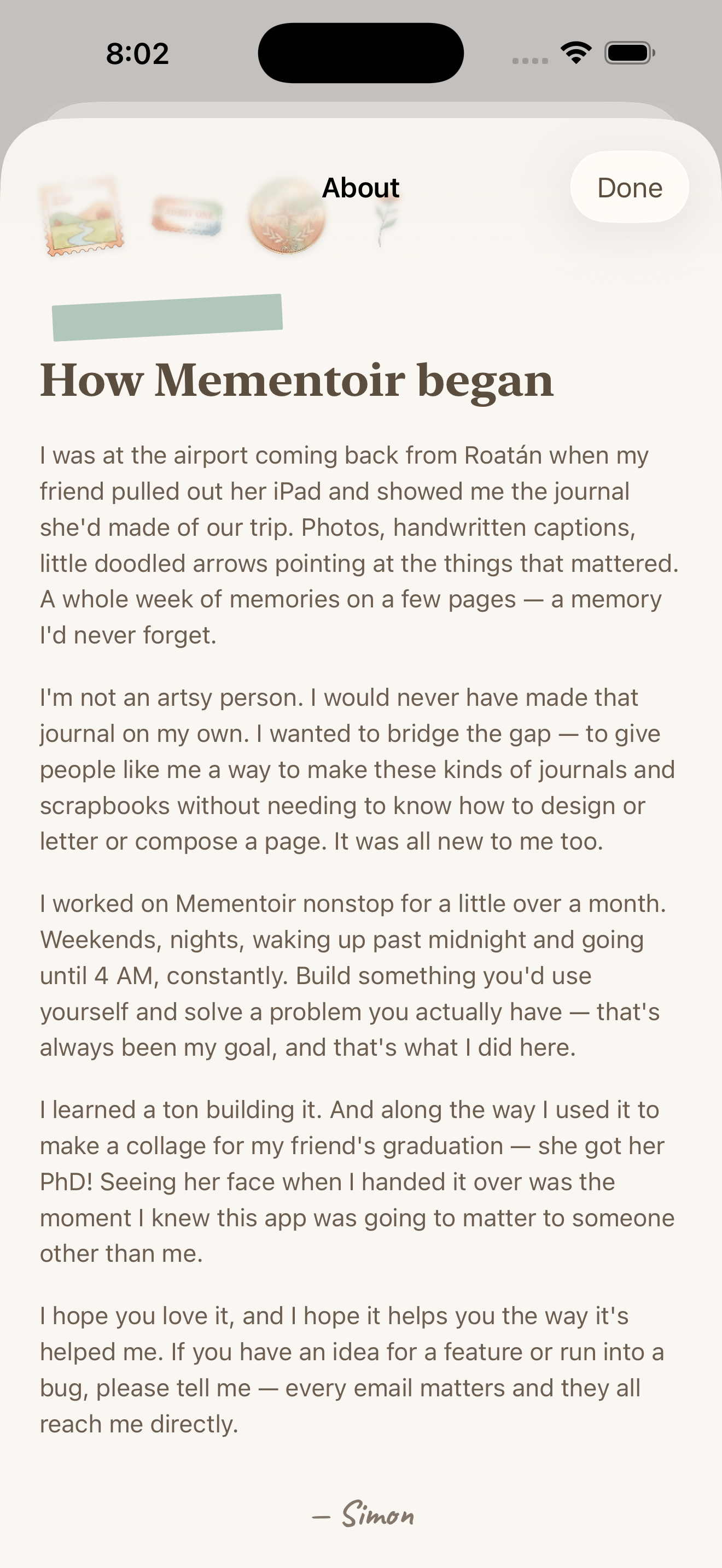
This is the screen I'd point at if someone asked what the difference is between an app and a product. You don't need the About page. The app works without it. But the About page is what makes the app a thing a person made, instead of a thing a company shipped — and the PhD-collage line is what makes it a thing that's been used by anyone other than me. I almost didn't write either of them. I'm glad I did.


Day 40 · May 20App Store screenshots

The last 48 hours were almost entirely about producing the screenshots Apple lets you upload to the listing — up to ten per device, in my case nine. Every other app on the store is fighting for the same 1.5 seconds of attention in search results, and those frames are how you win them.

My rule for the marketing layout: one headline of three or four words, one tagline beneath it, then the app doing the thing — framed cleanly, no badges, no "as seen in" chrome, no fake confetti. If the headline names the feature and the screenshot proves it, you've spent the user's attention well.

I organized the nine around the three things I most wanted a stranger to understand in 1.5 seconds: the layout engine, the Wizard, and the canvas tools. In that order.

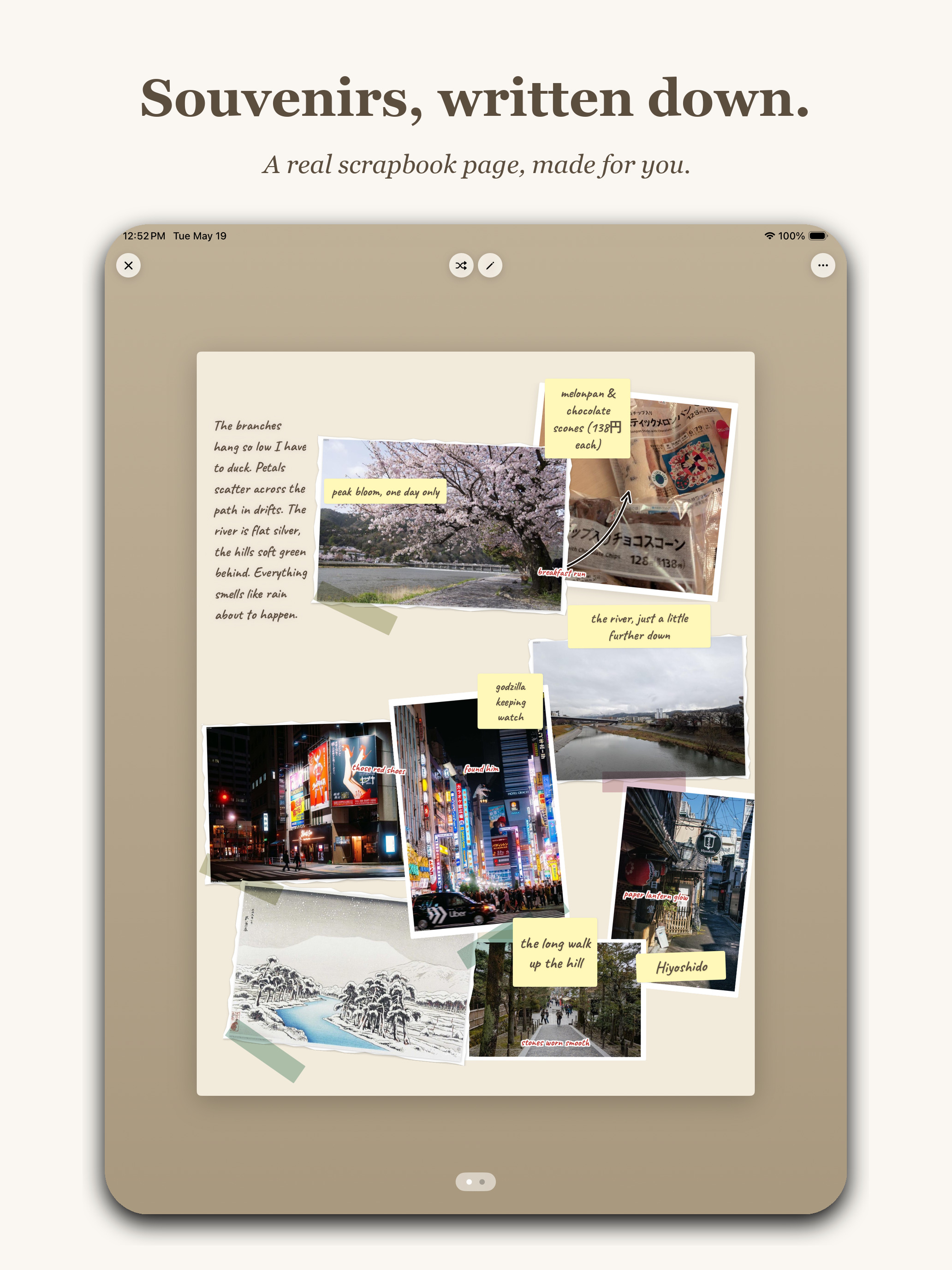
I. The layout engine

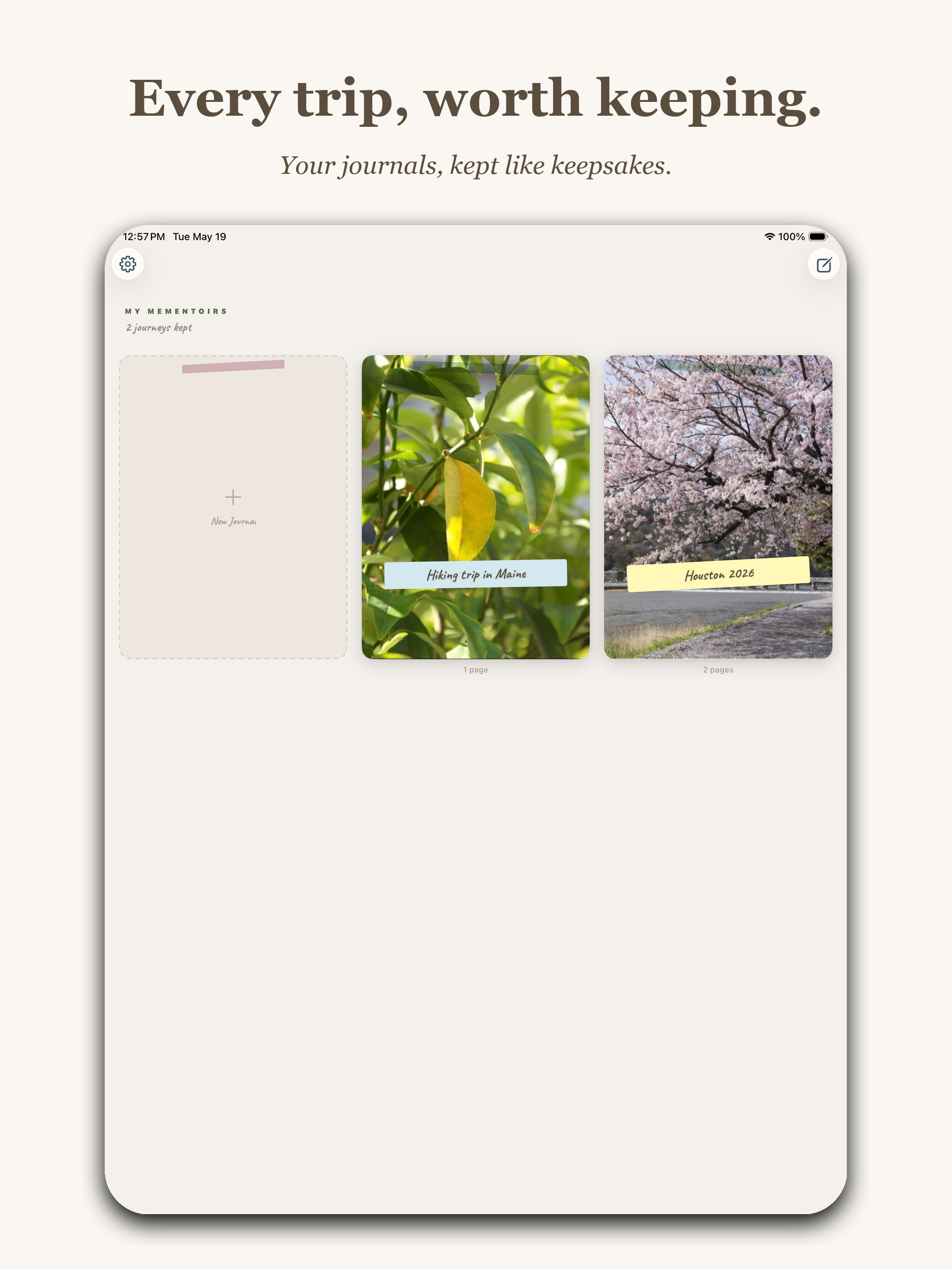
This is what the app is, before it's anything else: a system that takes a pile of photos and arranges them on a page like a person with taste would. The first two screenshots had to prove that — one zoomed in on a finished page, one zoomed out on a library of them.
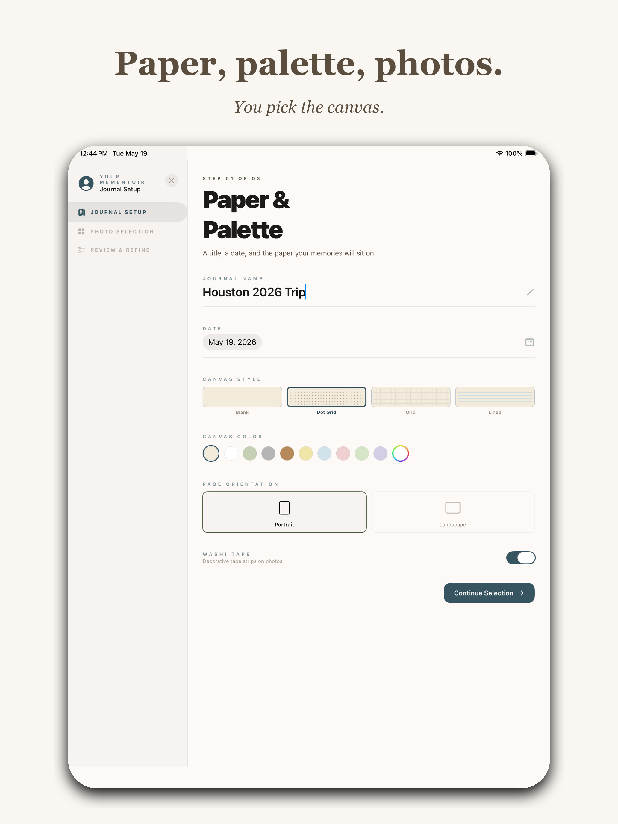
App Store marketing screenshot with headline Souvenirs, written down. and subtitle A real scrapbook page, made for you. Shows an iPad displaying a finished journal page on a beige background with multiple photos including cherry blossoms, a Tokyo neon street, a bridge, a snowy traditional Japanese print, washi tape, and yellow sticky-note captions reading peak bloom one day only, the river just a little further down, polish keeping watch, the long walk up the hill, washi tape and chocolate cones with crumbs only, and a body of handwritten prose down the left side describing the branches hanging low.
"Souvenirs, written down." Subtitle: A real scrapbook page, made for you. What a finished page looks like, no marketing chrome on the page itself. The handwritten prose down the left side is real text I wrote about a cherry-blossom morning in Kyoto.
App Store marketing screenshot with headline Every trip, worth keeping. and subtitle Your journals, kept like keepsakes. Shows an iPad home screen titled MY MEMENTOIRS with three card tiles: an empty New Journal placeholder, a leaf photo card labeled Hiking trip in Maine, and a cherry blossom photo card labeled Houston 2026.
"Every trip, worth keeping." Subtitle: Your journals, kept like keepsakes. The library view — what you own once you've used the app a few times. The plural "Mementoirs" works as a noun, which I still cannot believe I got away with.

II. The Wizard

The Wizard had to show up early in the listing because it's the feature that does the work most people are afraid to do themselves. Two screenshots — one for the setup, one for the human-in-the-loop refinement — followed by the "Stitched for you, or by you" frame you already saw earlier when I introduced the Magic Wizard above.

App Store marketing screenshot with headline Paper, palette, photos. and subtitle You pick the canvas. Shows an iPad displaying step 1 of 3 of the Wizard's Paper and Palette journal setup screen, with a journal name field reading Houston 2026 Trip, a date of May 19 2026, four canvas style options (Blank, Dot Grid, Grid, Lined) with Dot Grid selected, a row of canvas color swatches in pastels, page orientation toggles for Portrait and Landscape with Portrait selected, and a Washi Tape on toggle. A Continue Selection button sits at the bottom.
"Paper, palette, photos." Subtitle: You pick the canvas. Step 1 of the Wizard. Name, date, canvas style (Blank / Dot Grid / Grid / Lined), color palette, orientation, washi-tape toggle. Five decisions, then it gets out of the way.
App Store marketing screenshot with headline Edit any memory. and subtitle Write it yourself, or let us. Shows an iPad with an Edit Memory modal open over the Editor's Desk review screen. The modal contains a cherry blossom photo with the caption peak bloom, one day only, three buttons reading Trim, Cutout, and Annotate, a longer body of prose about branches hanging low and petals scattering on the path, and a CAPTION field. A Suggest button is at the bottom of the modal alongside Save Changes.
"Edit any memory." Subtitle: Write it yourself, or let us. The human-in-the-loop part. The Wizard drafts the caption ("peak bloom, one day only") and the longer prose underneath, and you nudge whatever doesn't feel right. The "Suggest" button at the bottom is the polite version of "rewrite this for me."

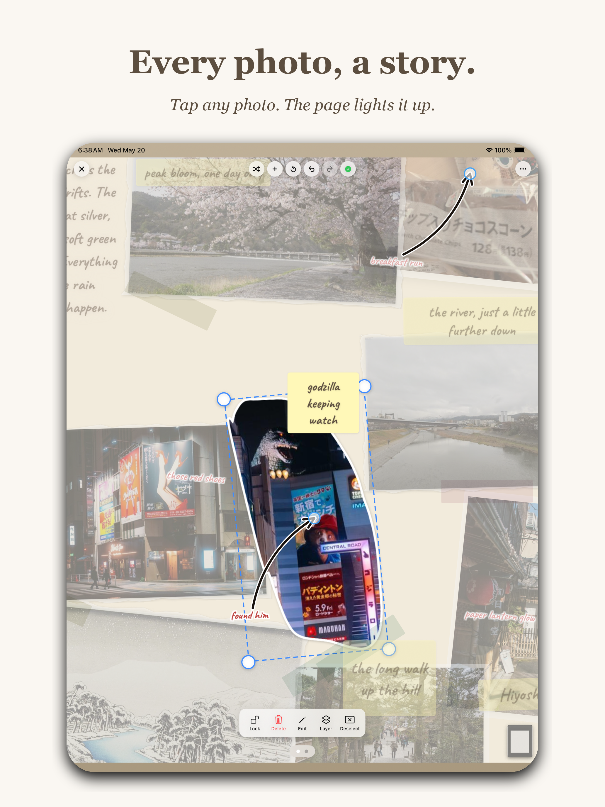
III. The canvas tools

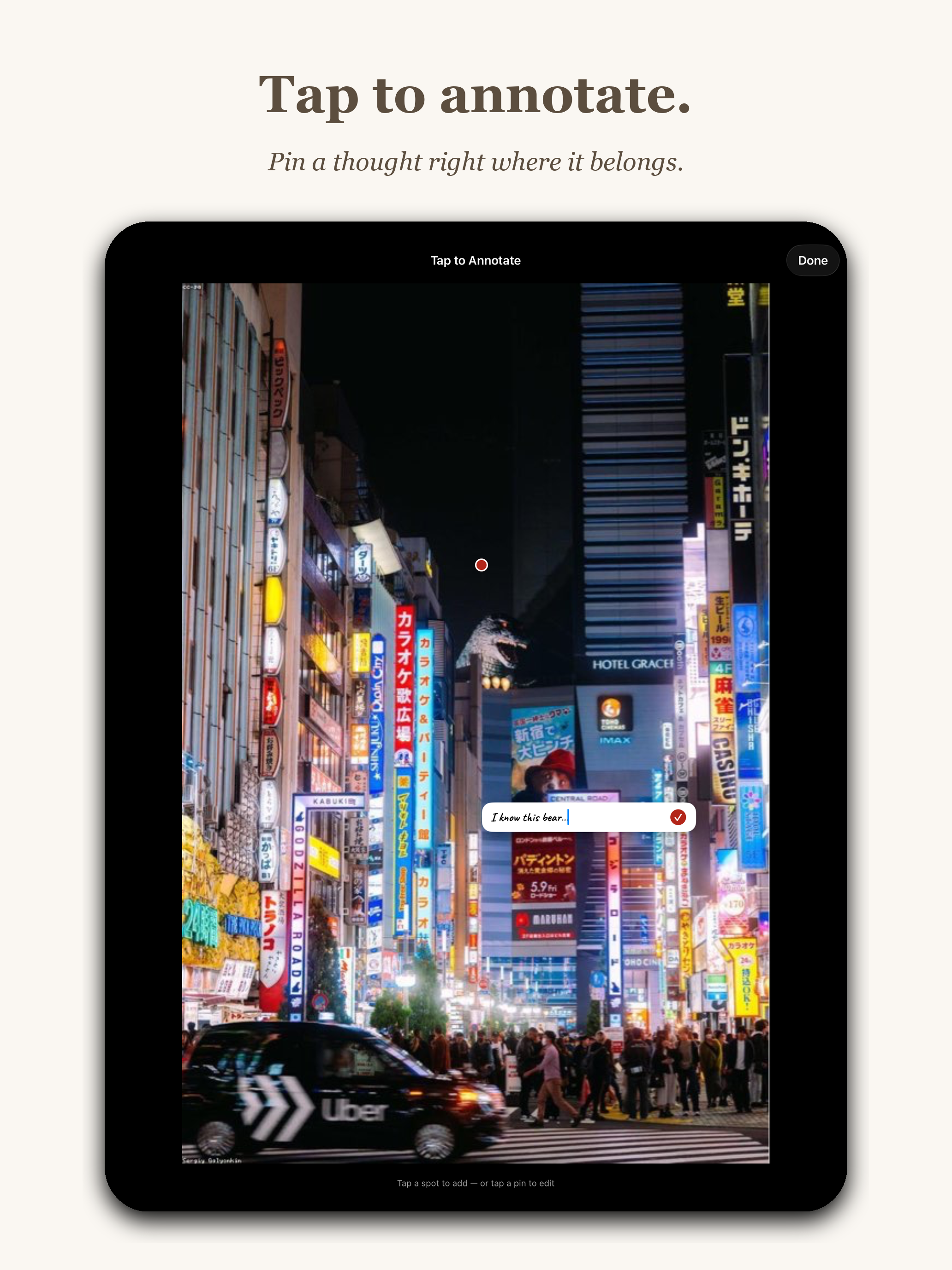
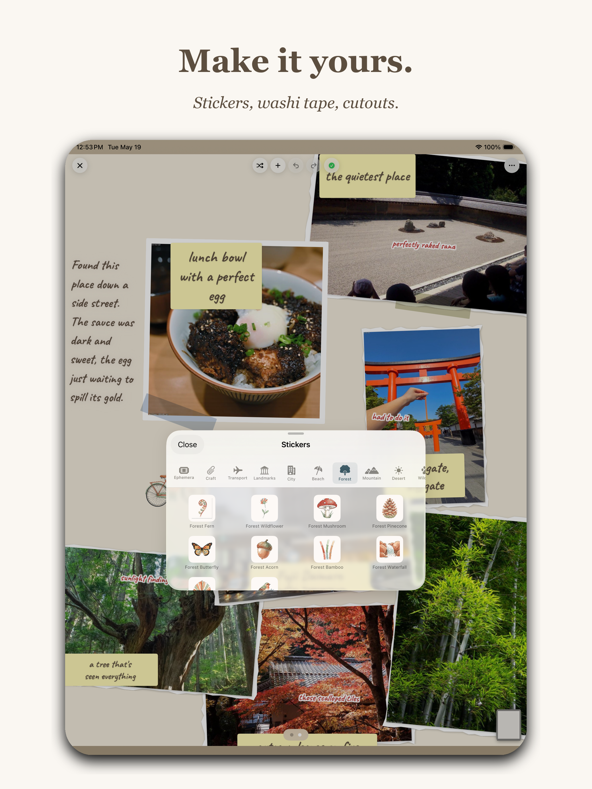
The last pillar: once the Wizard hands you a draft, what can you actually do to a page? Three screenshots covering the three most-used canvas actions — focus on a photo, tap to annotate it, decorate the page.

App Store marketing screenshot with headline Every photo, a story. and subtitle Tap any photo. The page lights it up. Shows an iPad with a single Polaroid photo of a Godzilla figure on a Tokyo street pulled forward from a dimmed scrapbook page. The selected photo has cyan transform handles around it, a sticky-note label reading godzilla keeping watch, and a small arrow drawing pointing to it with the text found him.
"Every photo, a story." Subtitle: Tap any photo. The page lights it up. Tap any photo on a page and it pulls forward, dims everything else, and lets you nudge, rotate, or replace it. The other elements fade so you can think about one thing at a time.
App Store marketing screenshot with headline Tap to annotate. and subtitle Pin a thought right where it belongs. Shows an iPad with a full-bleed photo of a neon Tokyo street at night with bright Japanese and English signs. A red pin marker sits on one of the signs and a small text input field reads I know this bear. Header reads Tap to Annotate with a Done button.
"Tap to annotate." Subtitle: Pin a thought right where it belongs. Drop a pin anywhere on a photo, type a note, save. "I know this bear." That's the entire interaction.
App Store marketing screenshot with headline Make it yours. and subtitle Stickers, washi tape, cutouts. Shows an iPad with a journal page in the background featuring photos of a rock garden, lunch bowl, torii gate, bamboo and trees, with the Stickers picker modal in the foreground showing a Forest category with icons including Forest Fern, Forest Wildflower, Forest Mushroom, Forest Pinecone, Forest Butterfly, Forest Acorn, Forest Bamboo, and Forest Waterfall.
"Make it yours." Subtitle: Stickers, washi tape, cutouts. The 5 AM era's entire reason for existing. Every one of these little forest icons (fern, wildflower, mushroom, pinecone, butterfly, acorn, bamboo, waterfall) is a hand-prompted asset. The page underneath is real content from a Kyoto trip — "lunch bowl with a perfect egg" is one of mine.

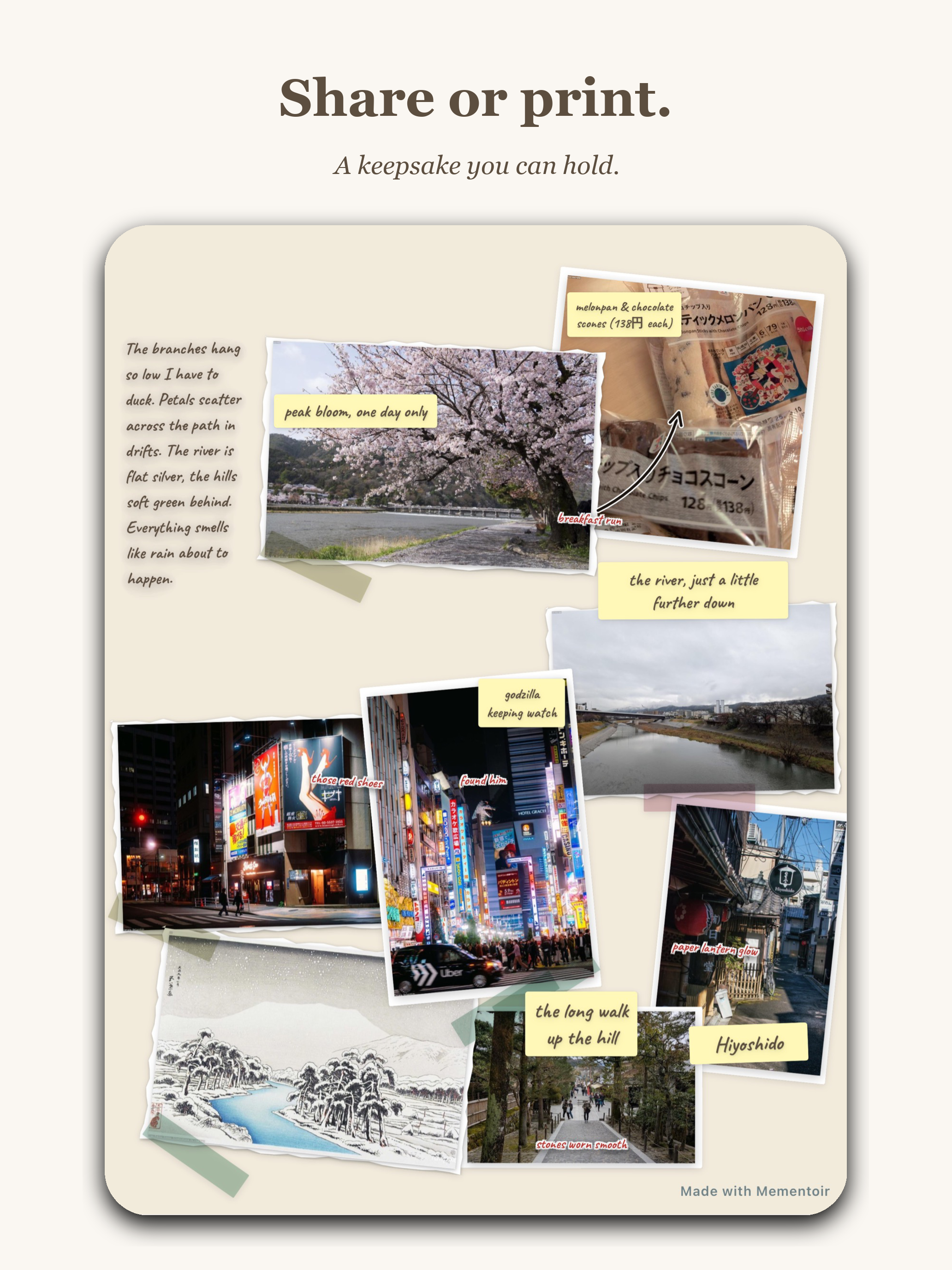
IV. And finally — share or print

The last frame had to answer the question "okay, what do I do with the thing I made?" The honest answer is: anything you want, but specifically, you can export it as a PDF that prints cleanly, or share it as an image. The export carries a small "Made with Mementoir" watermark in the corner, and that's the only place I let the app's brand sit on top of the user's content.

App Store marketing screenshot with headline Share or print. and subtitle A keepsake you can hold. Shows a finished Mementoir journal page on a beige background with multiple Polaroid photos, washi tape, yellow sticky-note captions, and prose. A small Made with Mementoir watermark sits in the bottom-right corner of the page.
"Share or print." Subtitle: A keepsake you can hold. The export view — same page, exportable as PDF for print or image for share. The little "Made with Mementoir" watermark in the bottom corner is the only place the app's brand touches the user's work.

Day 42 · May 22Submit for Review

This morning, at 11:27 AM, I opened App Store Connect, ran through the build summary one more time, scrolled to the bottom, and tapped Submit for Review.

The button is small. The hesitation before tapping it is not.

Submitted for Review May 22, 2026 · 11:27 AM

Now it's in the queue. Apple says 24–48 hours, which historically means anywhere between four hours and a week. The first rejection (if there is one) is almost certainly going to be about my subscription disclosure language. The second one (if there is one) is anyone's guess.

But the part that was mine to control is done.

Forty-two days from the first wireframe to a build sitting in front of an Apple reviewer. About 350 screenshots taken, twenty of which made it into these two blog posts. One name. One Magic Wizard. One About page that almost broke me. One submit button.

Whatever happens next — approval, rejection, downloads, silence — I made this. And I have the screenshots to prove it.