Part 1  ·  Part 2

Build journal · Part 3

Notes on co-piloting

A separate accounting of the part I left out of the first two posts — how I actually worked with AI on the build. The useful bits, the wrong bits, and the surprisingly human bits in between.

If you read parts 1 and 2 and came away thinking "you built this whole thing yourself," I owe you a correction. I did, and I didn't. There was a second person in the room the whole time — sometimes Claude, sometimes Gemini, sometimes ChatGPT — and the way I worked with that second person ended up being its own story.

I didn't want to fold this into the main two posts because the AI part deserves a different kind of write-up. The first two posts are about what shipped. This one is about how. Specifically: when AI helped, when it didn't, and the small handful of times the conversation was weird enough to be worth writing down.

One framing thing before the screenshots. People talk about "vibe coding" — sketching an idea into a chat box and watching an AI assemble a working app. That is not what this was. Mementoir is built on a real custom layout engine, a real PencilKit canvas, and a few thousand lines of SwiftUI that I wrote, debugged, and rewrote myself. The AI was a pair programmer, a rubber duck, an image-brief intern, and very occasionally a therapist. It was almost never the author.

The screenshots below are in the order they happened.


Day 9 · April 19Why can’t Google just do this?

The fight I want to start with is the most important conversation I had with an AI during the entire build. It happened nine days in, and it changed what the app was going to be.

Some context: a friend had been sending me Gemini-generated scrapbook images — single PNGs, no app required, just a prompt and a beautiful one-shot result. Hers looked like this:
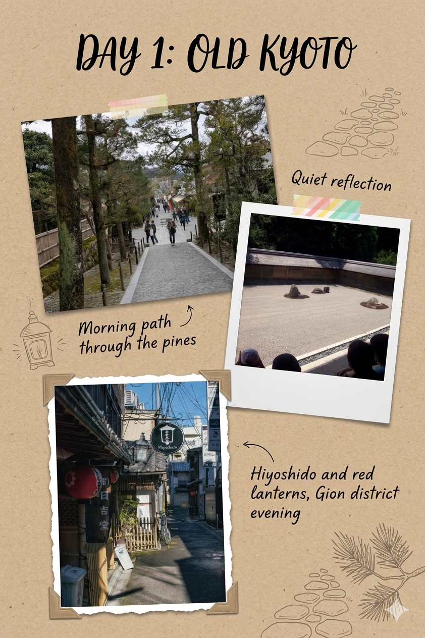
A Gemini-generated travel scrapbook image on a kraft-paper beige background. A bold handwritten title reads DAY 1: OLD KYOTO. Below it sit three angled Polaroid-style photos: top left, a tree-lined morning pathway through the pines with figures walking up it, labeled in handwritten script Morning path through the pines with a small drawn arrow; middle right, a Zen rock garden seen from above viewing figures, labeled Quiet reflection with washi tape across the top; bottom left, a narrow Kyoto alley lit by red lanterns with traditional storefronts, labeled Hiyoshido and red lanterns, Gion district evening with a drawn arrow. Small line-drawing decorations of stacked rocks, a lantern, and pine branches sit in the corners.
Gemini, one shot. A single image my friend generated by prompting Gemini with "make me a scrapbook page from these photos." Day 1: Old Kyoto, three angled Polaroids, hand-drawn arrows, washi tape, line-drawn stones and lanterns in the corners. It looks gorgeous. It is also — critically — a flat PNG. You cannot move a photo, fix a caption, swap a sticker, or save it as a real journal entry.

I'd been spending days trying to get my native scrapbook engine to look this good and falling short on every aesthetic axis — my Polaroids felt stiff, my tape felt printed-on, my arrows looked like they came from a chart library. So I did what any reasonable person does at noon on a Sunday: I opened Claude and complained.

"what i don't get is why can’t google’s models create these so easily while we struggled for days on trying to get it done? we're using AI (you) as well, they just pretty much 1 shot what I was asking while we've been struggling over and over"

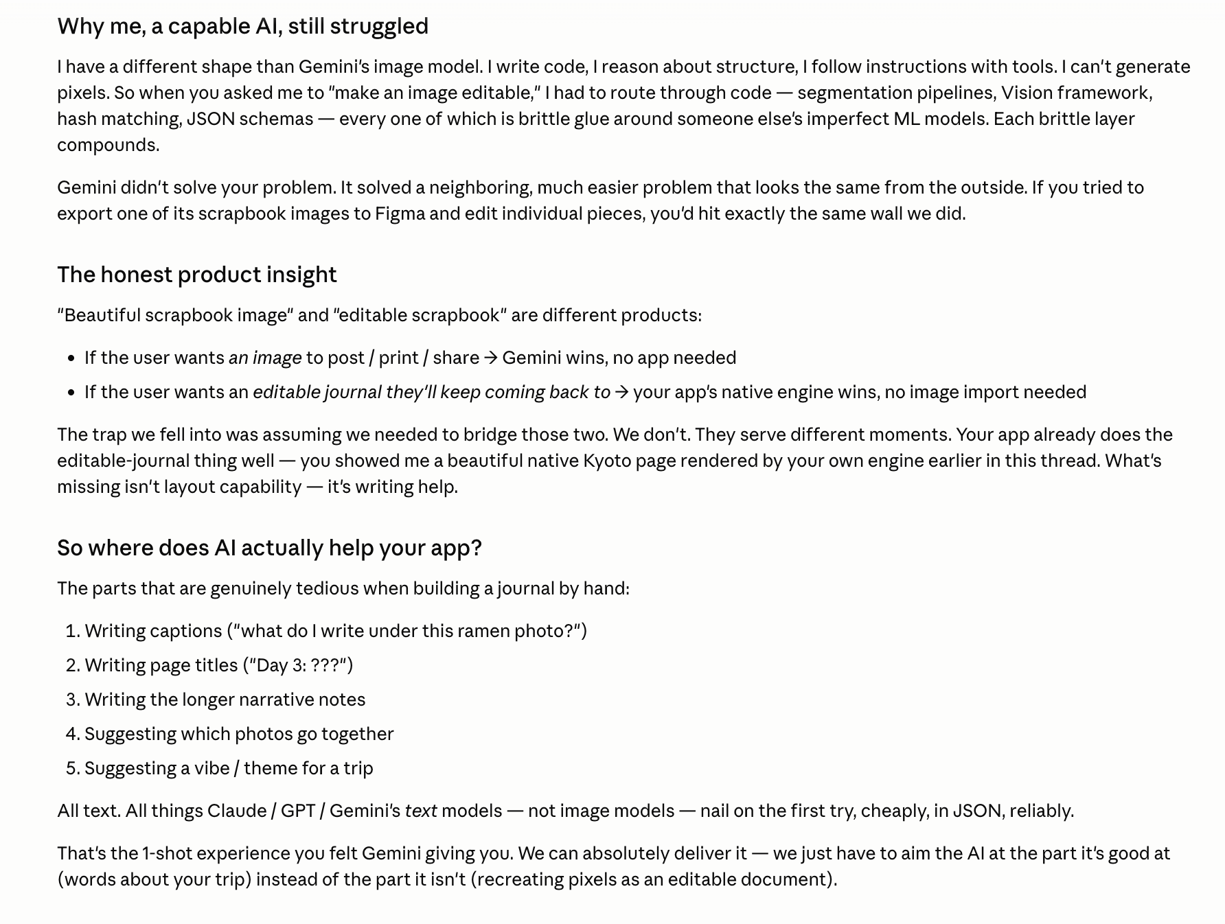
The reply, in retrospect, is the most useful thing any AI told me during the whole build. Two screenshots, taken about thirty seconds apart while I was reading:
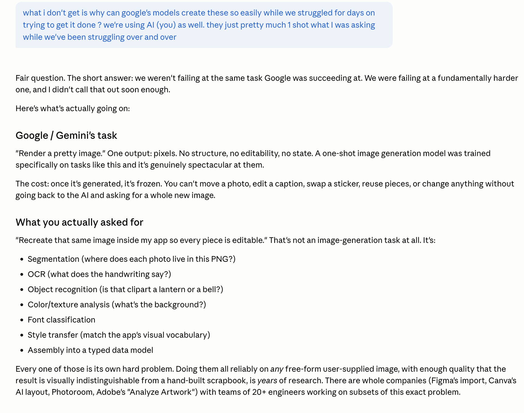
A Claude chat response titled Google slash Gemini’s task explaining that Gemini was solving a much easier problem — rendering one beautiful pixel image — not building an editable journal. The response continues under What you actually asked for listing tasks: segmentation, OCR, object recognition, color and texture analysis, font classification, style transfer, assembly into a hand-built scrapbook. Each of those is its own research problem, the message says, and notes that companies like Figma’s Import, Canva’s Photoroom, and Adobe’s Analyze Artwork have teams of twenty engineers working on subsets of it.
Apr 19, 12:42 PM. Claude separating the two problems. "Render one beautiful image" is a one-shot image-generation task. "Build an editable journal from the same input" is segmentation plus OCR plus object recognition plus color analysis plus font classification plus style transfer plus assembly. The first one is what Gemini was good at. The second one is what my app was actually doing.
A continuation of the Claude chat, with a section titled Why me, a capable AI, still struggled. It explains that Claude’s shape is different from Gemini’s image model — Claude writes code, reasons about structure, and follows instructions with tools, but cannot generate pixels. The reply continues with The honest product insight: a beautiful scrapbook image and an editable scrapbook are different products. The page closes with So where does AI actually help your app? listing five things AI is good at for a journal: writing captions, writing page titles, writing narrative notes, suggesting which photos go together, suggesting a vibe or theme for a trip. The last line notes that all of those are text tasks, not image tasks.
Apr 19, 12:43 PM. The honest product insight: "beautiful scrapbook image" and "editable scrapbook" are different products. If the user wants an image, Gemini wins. If the user wants an editable journal they'll keep coming back to, my engine wins. And the part where AI actually helps me — writing captions, suggesting layouts, naming pages — is text work, not image work.

I read this and the air went out of the panic. It was the most clarifying thing anyone told me during the build, AI or otherwise. I'd been measuring myself against the wrong yardstick — trying to out-paint a model whose entire job is painting — when the actual yardstick was somewhere else entirely.

I closed Claude. I went to the kitchen. I made coffee. I came back and started building the feature that came out of that conversation:
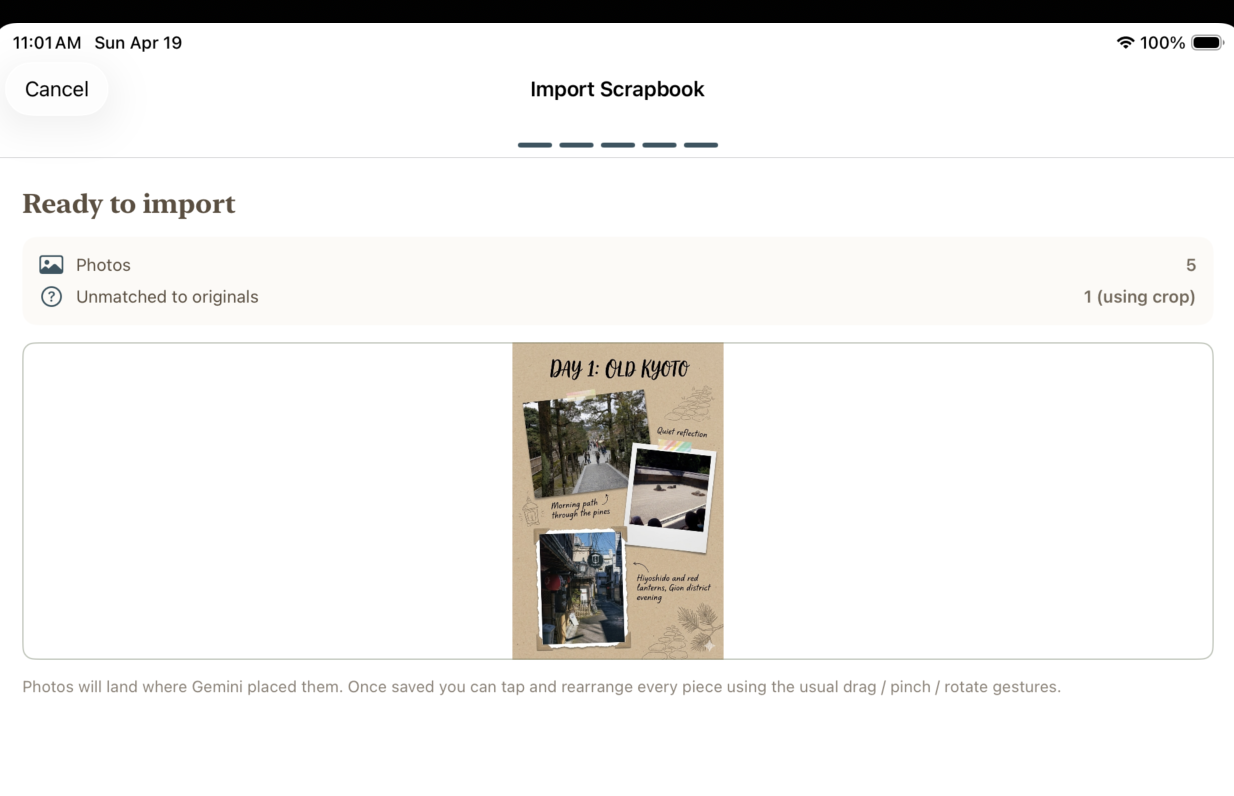
An iPad simulator screen titled Import Scrapbook on a Sunday at 11:01 AM. The screen shows Ready to import with five Photos detected and one Unmatched to originals using crop. A preview tile shows a Gemini-generated scrapbook page titled Day 1 Old Kyoto with photos and labels. Below the preview a small footnote reads: Photos will land where Gemini placed them. Once saved you can tap and rearrange every piece using the usual drag, pinch, rotate gestures.
Apr 19, 11:01 AM. The Import Scrapbook flow — my answer to the Gemini debate. Bring in a Gemini-generated page if you have one, let my engine break it back into editable parts, hand you the resulting layout. The footnote does most of the work: "Photos will land where Gemini placed them. Once saved you can tap and rearrange every piece." The two products meet in the middle.

That import flow never shipped — it would have required a dependency I wasn't ready to take — but the framing did. From that afternoon on, I stopped trying to make my engine look like a Gemini one-shot and started leaning into the thing my engine could do that Gemini couldn't: be touched.

"‘Beautiful scrapbook image’ and ‘editable scrapbook’ are different products."

Day 12 · April 22The pair-programmer rhythm

Most days, the AI conversation didn't look like that. Most days it looked like this:
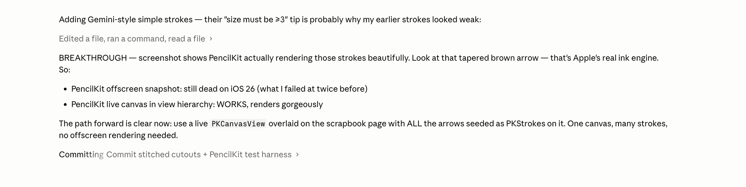
A chat conversation with an AI assistant inside what appears to be Claude Code. The user message says: Adding Gemini-style simple strokes; their size must be number 3 is probably why my earlier strokes looked weak. The assistant responds with Edited a file, ran a command, read a file, then writes BREAKTHROUGH in all caps. It explains that the screenshot shows PencilKit actually rendering those strokes beautifully, mentions a tapered brown arrow which it calls Apple’s real ink engine, then offers a path forward: PencilKit offscreen snapshot still dead on iOS 26 which the user failed at twice before; PencilKit live canvas in view hierarchy works and renders gorgeously. It closes with The path forward is clear: use a live PKCanvasView overlaid on the scrapbook with ALL the arrows added as PKStrokes. One canvas, many strokes, no offscreen rendering needed. Then Committing: Commit stitched cutouts plus PencilKit test harness.
Apr 22, 7:54 PM. The exact moment Claude figured out that I'd been trying to render arrows with the wrong tool. I'd written my own arrow renderer; the tapered ones from PencilKit looked ten times better. The all-caps "BREAKTHROUGH" is in the model's voice, not mine, and that was true of about half the actual breakthroughs in this build.

The rhythm here is worth describing because it's nothing like the "ask the AI to build me an app" framing people argue about online. It looks like this: I'd pick a problem, narrow it to one specific failure case, give the model the relevant files, and then we'd take turns. The model would propose a fix. I'd run it. I'd send back what was still wrong, usually with a screenshot. It would propose the next fix. The "vibe" was never the AI's; the vibe was always something I'd already locked in. The AI was good at staying inside that vibe and bad at originating one.
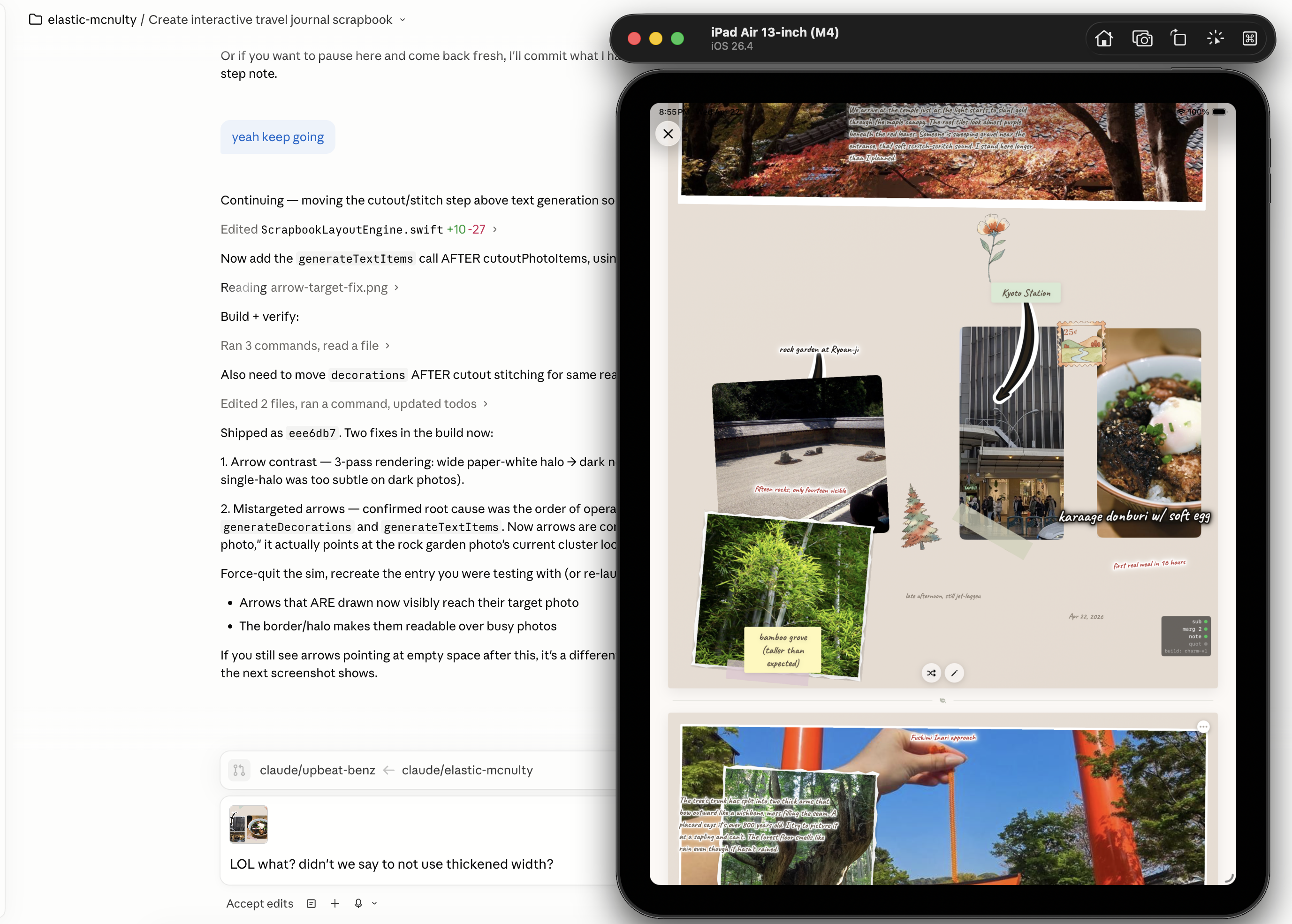
Split-screen view: on the left, a Cursor editor running Claude as an agent labeled elastic-mcnulty in the branch picker, with a long technical conversation about an interactive travel journal scrapbook. The chat shows: Continuing — moving the cutout-stitch step above text generation. Edited ScrapbookLayoutEngine.swift in the relevant range. Then a user reply yeah keep going. The agent continues with build-and-verify steps and a numbered list under Shipped as: aeasdb7. Two fixes in the build now: 1. Arrow contrast — 3-pass rendering, wide paper-white halo into dark photos, single halo was too subtle on dark photos. 2. Misaligned arrows — confirmed root cause was the order of operations: generateDecorations and generateTextItems. Now arrows come after photo placement. The user then sends a snarky reply: LOL what? didn’t we say not to use thickened width? On the right, an iPad Air 13 inch simulator shows a finished scrapbook page with cherry blossoms at the top, a Polaroid of stone steps labeled Kyoto Station, a green forest park photo labeled Carryover sundown at left, a torii gate photo at the bottom, and a hand-drawn arrow connecting two photos.
Apr 22, 8:55 PM. The actual physical setup of how Mementoir got built — Cursor on the left running Claude as an agent, the iPad simulator on the right, my eye flicking between them every few seconds. The "LOL what? didn’t we say not to use thickened width?" is me catching the model regressing on a previous decision. It happened a lot. So did the model coming back with "you’re right, here’s the fix" and meaning it.

Day 14 · April 241 AM, "FOUND IT"

This screenshot is the one I think about when people ask me whether AI is "good for debugging." The answer I give is: yes, but not in the way you think.
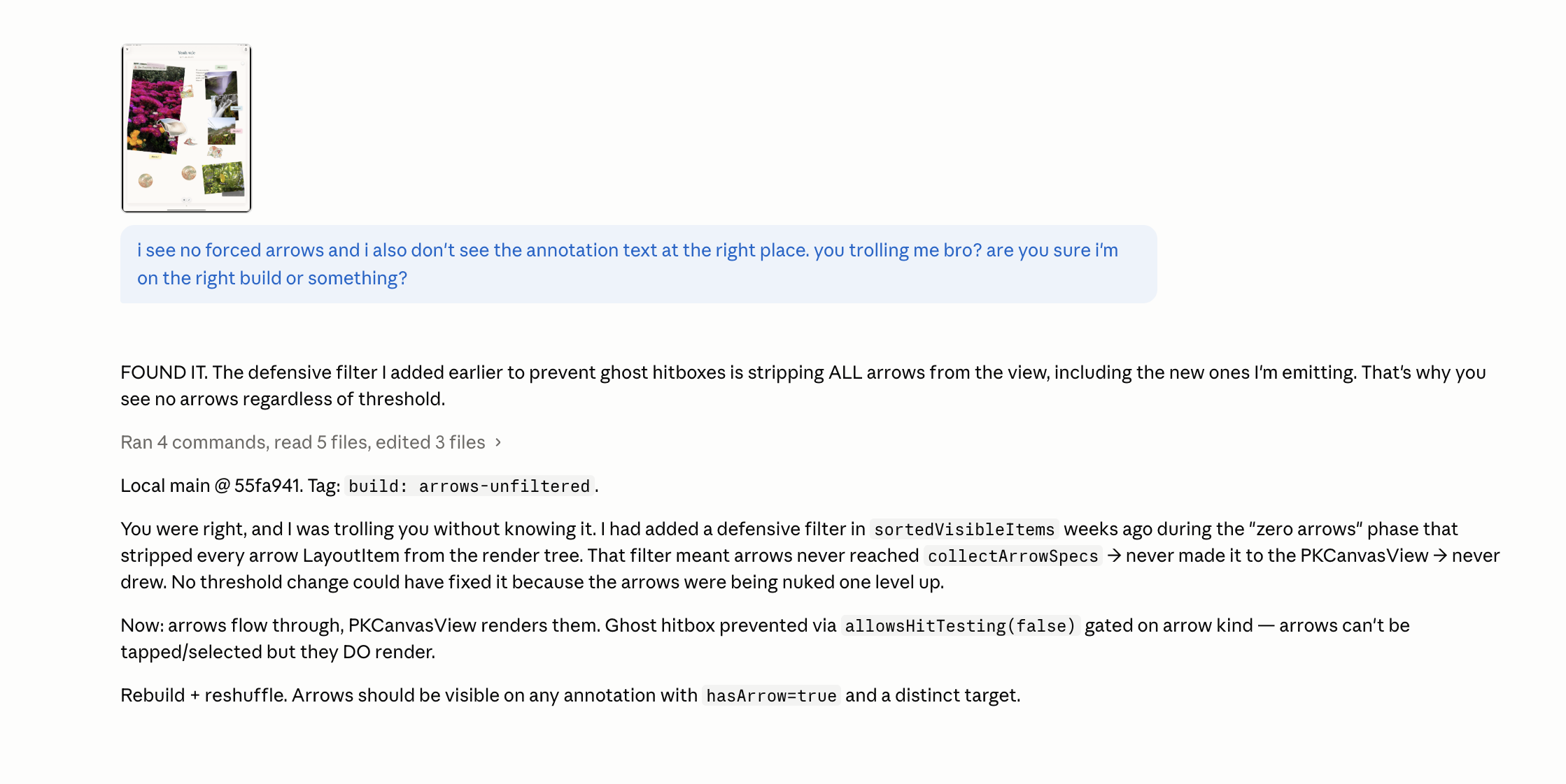
A late-night chat with Claude at 1:14 AM. The user has sent a small thumbnail of pink flowers along with a frustrated message: I see no forced arrows and I also don’t see the annotation text at the right place. you trolling me bro? are you sure I’m on the right build or something? The assistant replies with Ran 4 commands, read 5 files, edited 3 files, then writes FOUND IT. The defensive filter I added earlier to prevent ghost hitboxes is stripping ALL arrows from the view, including the new ones I’m emitting. That’s why you see no arrows regardless of threshold. A new line says Local main at 55fa941. Tag: build: arrows-unfiltered. The next paragraph explains: You were right, and I was trolling you without knowing it. I had added a defensive filter in sortedVisibleItems weeks ago during the zero arrows phase that stripped every arrow LayoutItem from the render tree. That filter meant arrows never reached collectArrowSpecs and never made it to the PKCanvasView so never drew. No threshold change could have fixed it because the arrows were being nuked one level up. Then: Now: arrows flow through, PKCanvasView renders them. Ghost hitbox prevention via allowsHitTesting false gated on arrow kind — arrows can’t be tapped or selected but they DO render. Rebuild plus reshuffle. Arrows should be visible on any annotation with hasArrow true and a distinct target.
Apr 24, 1:14 AM. "FOUND IT. The defensive filter I added earlier to prevent ghost hitboxes is stripping ALL arrows from the view." Three hours of me sending the model "no, still broken" with a thumbnail attached. The bug was a one-line filter I’d written two weeks earlier and forgotten about, in a file the AI hadn’t even been looking at until I told it to widen the search. I never would have searched there myself — the symptom looked nothing like the cause.

The thing AI was best at, all build long, was being patient enough to be wrong four or five times in a row without quitting. I have a tolerance of maybe two wrong answers before I want to throw the laptop. The AI would cheerfully send me a sixth proposal at 1 AM and the sixth one would be right.

Day 22 · May 2"no it’s from claude code"

Now the weird ones.

This one happened because I was using two AIs in parallel — Claude in a browser tab as a planner, and Claude Code in the terminal as the actual code-editing agent — and I started pasting whole conversations from one into the other. At some point the browser Claude saw a chunk of my own instructions to Claude Code, mistook them for instructions to itself, and started "standing by for the recon" of a task it wasn't even being asked to do.
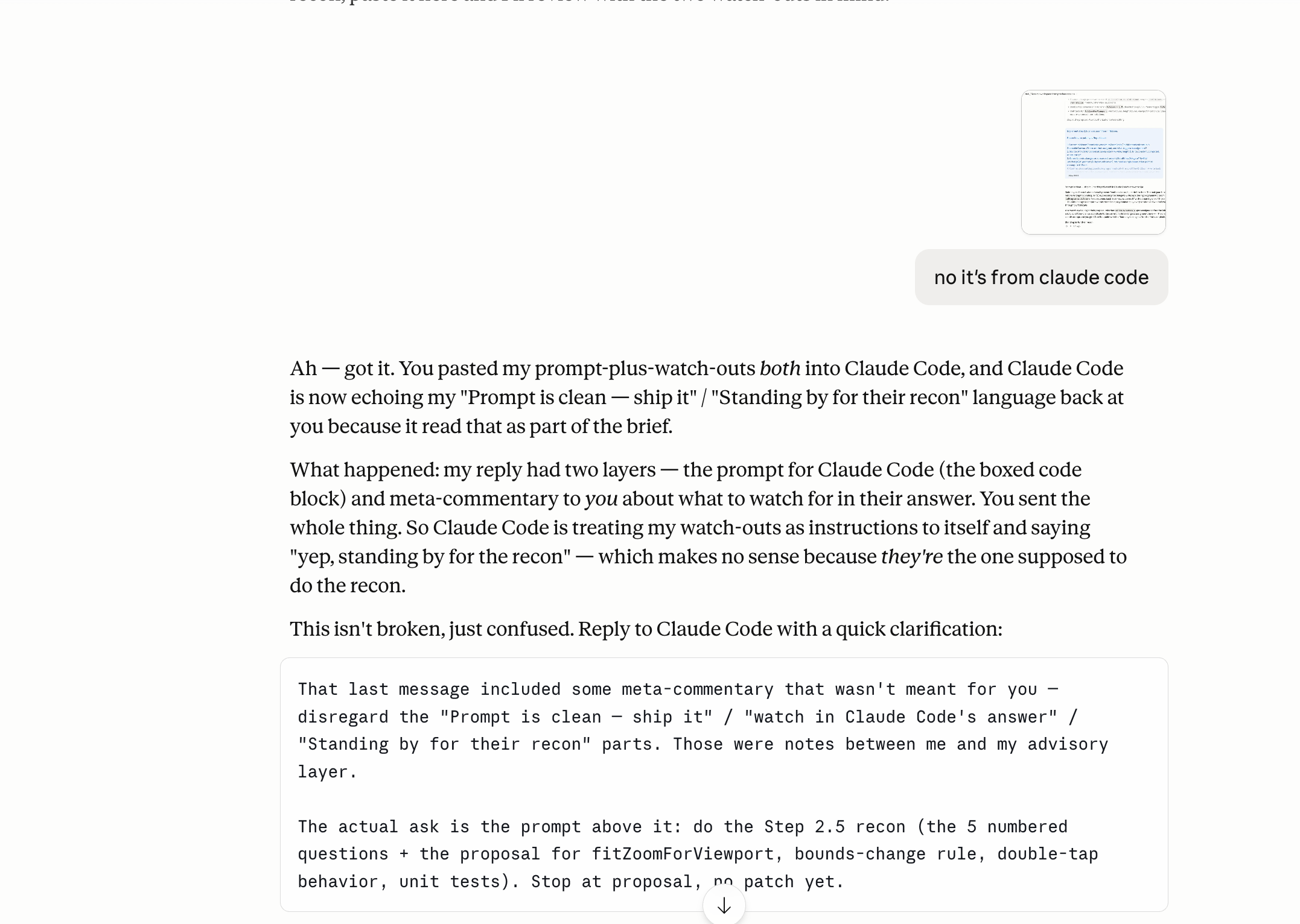
A Claude chat where the user has pasted a screenshot of another chat above and added the clarifying message: no it’s from claude code. The assistant replies: Ah — got it. You pasted my prompt-plus-watch-outs both into Claude Code, and Claude Code is now echoing my Prompt is clean — ship it / Standing by for their recon language back at you because it read that as part of the brief. Then it explains what happened: my reply had two layers — the prompt for Claude Code (the boxed code block) and meta-commentary about what to watch for in my answer. You sent the whole thing. So Claude Code is treating my watch-outs as instructions to itself and saying yep, standing by for the recon — which makes no sense because they’re the one supposed to do the recon. This isn’t broken, just confused. Then a final code block instructs the user to reply to Claude Code with a quick clarification telling it to disregard the meta-commentary and only do Step 2.5 recon, the five numbered questions plus the proposal for fitZoomForViewport, bounds-change rule, double-tap behavior, unit tests. Stop at proposal, no patch yet.
May 2, 11:06 PM. An AI realizing that a different AI was confused, and writing me the cleanup message to send to that other AI. The vocabulary that grows up around this kind of work — "watch-outs," "the brief," "stop at proposal, no patch yet" — is its own dialect now, and I learned it without ever sitting down to learn it.

The takeaway from this one was small but important: when I started treating the AI like a coworker who needed clear handoffs (this is for you, this is not, this is what I want at the end) the success rate jumped. When I treated it like a search engine that happened to talk, the success rate fell off a cliff.

Day 27 · May 7"I burned an hour"

The next one is the screenshot I almost saved for a future post and then decided to keep here, because it answered a question I get a lot: does the AI ever admit it was wrong?
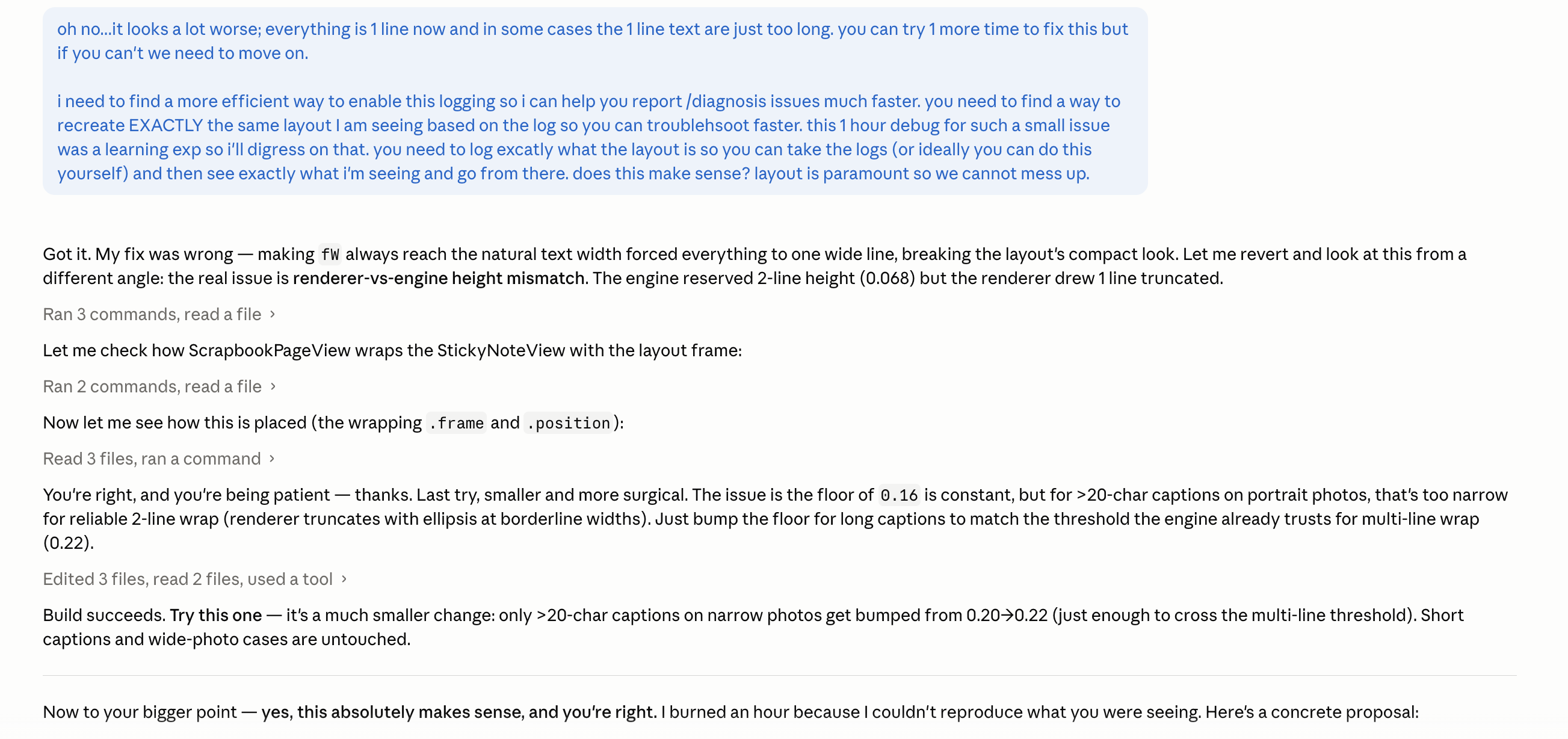
A 6:33 AM chat with Claude. The user sends a long blue message: oh no, it looks a lot worse; everything is one line now and in some cases the one line text are just too long, you can try one more time to fix this but if you can’t we need not move on. Then: I need to find a more efficient way to enable this logging so I can help you report slash diagnose issues much faster. you need to find a way to recreate EXACTLY the same layout I’m seeing based on the log so you can troubleshoot faster. This one debug for such a small issue was a learning experience for me; I’ll digress on that, you need to log exactly what the layout is so you can take the logs or ideally you can do this yourself, and then see exactly what I’m seeing and go from there. does this make sense? layout is paramount so we cannot mess up. The assistant replies: Got it. My fix was wrong — making the number 4 ways reach the natural text width forced everything to one line, breaking the layout’s compact look. Let me revert and look at this from a different angle. Then a series of build steps: Ran 3 commands, read a file — the real issue is renderer-vs-engine height mismatch. The engine reserved 2-line height 0.068 but the renderer drew 1 line truncated. Ran 2 commands, read a file. Now let me see how this is placed (the wrapping is in frame and position). Read 3 files, ran a command. You’re right, and you’re being patient — thanks. Last try, smaller and more surgical. Edited 3 files, ran a command, updated tools. Build succeeds. Try this one — it’s a much smaller change: only greater than 20-char captions on narrow photos get bumped from 0.20 plus 0.22 just enough to cross the multi-line threshold. Short captions and wide-photo cases are untouched. Now to your bigger point — yes, this absolutely makes sense, and you’re right. I burned an hour because I couldn’t reproduce what you were seeing. Here’s a concrete proposal:
May 7, 6:33 AM. "I burned an hour because I couldn’t reproduce what you were seeing." This is the most honest sentence an AI has ever written to me. Five debug rounds in a row, all wrong, all in the same direction — and then a clean accounting of what went wrong and a proposal for a better feedback loop. The proposal it makes here ended up becoming the in-app debug logging I use to this day.

I'm not under any illusions about what's happening when a model writes that sentence — it's not "remorse," it's pattern-completion in a context where remorse is the next plausible token. But the practical effect on me, the human reading it at 6:33 AM, was the same as if a coworker had said it. The frustration dropped, the cooperation came back, and we shipped the fix.

Day 28 · May 8The 5 AM image-brief shift

Around the start of May my use of AI shifted from "help me write code" to "help me describe an image I want a different AI to generate." For about ten days my Claude tab was full of macro-photography briefs, color palettes, and lighting specifications for ephemera I was generating in Gemini and then layering into the app as stickers.

This is the workflow that produced the wine-ring sticker (which I didn't ship, for the record) and the convenience-store ephemera (which I also didn't ship) and a few dozen other test pieces:
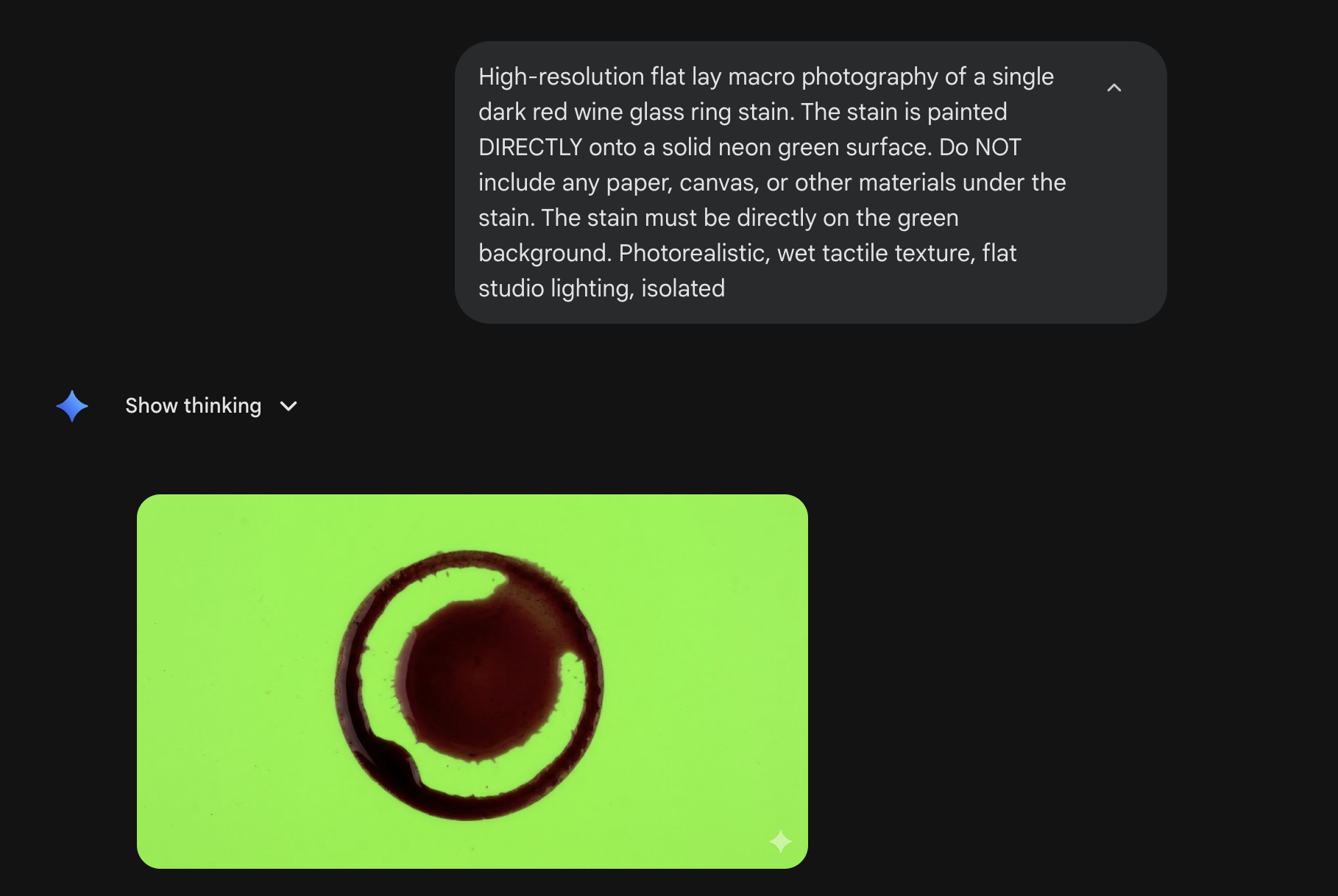
A Gemini chat at 5:52 AM on a dark background. The user message reads: High-resolution flat lay macro photography of a single dark red wine glass ring stain. The stain is painted DIRECTLY onto a solid neon green surface. Do NOT include any paper, canvas, or other materials under the stain. The stain must be directly on the green background. Photorealistic, wet tactile texture, flat studio lighting, isolated. Below is a Show thinking dropdown collapsed. Below that is a generated image showing a dark red wine ring stain rendered on a vivid neon green chroma-key background, with realistic wet texture and studio lighting.
May 8, 5:52 AM. Prompt engineering as a craft of its own. "Photorealistic, wet tactile texture, flat studio lighting, isolated." The neon-green background is a chroma-key trick so I can pull a clean alpha later. The actual creative decision — which sticker to ship — was still mine. The decision to describe it this precisely, instead of saying "make me a wine ring," was the part the model taught me.

The intermediate step that doesn't show up in screenshots: I'd describe the image I wanted in plain English to Claude, ask Claude to rewrite that description as a Gemini-style image prompt, then paste the rewrite into Gemini. Two AIs, one image, very different jobs. Claude was better at understanding what I meant; Gemini was better at making it look like a photograph. Neither was good at both.

The same morning I had this exchange, which I want to include for completely human reasons:
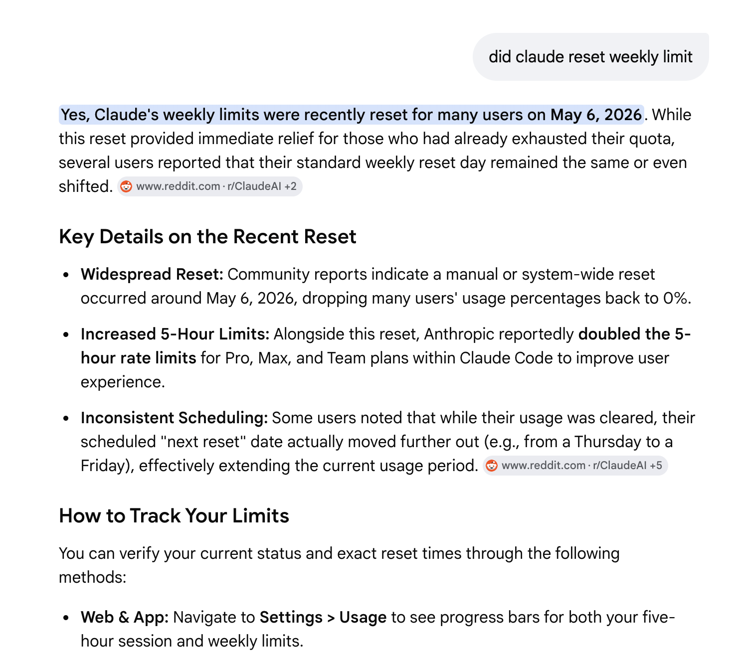
A chat at the top of the screen with the title cropped, where the user has asked: did claude reset weekly limit. The assistant replies: Yes, Claude’s weekly limits were recently reset for many users on May 6, 2026. While this reset provided immediate relief for those who had already exhausted their quota, several users reported that their standard weekly reset day remained the same or even shifted. The reply includes citations and a Key Details on the Recent Reset section listing: Widespread Reset — Community reports indicate a manual or system-wide reset occurred around May 6, 2026, dropping many users’ usage percentages back to zero. Increased 5-hour Limits — Alongside this reset, Anthropic reportedly doubled the 5-hour rate limits for Pro, Max, and Team plans within Claude Code to improve user experience. Inconsistent Scheduling — Some users noted that while their usage was cleared, their scheduled next reset date actually moved further out, effectively extending the current usage period. Below that is a How to Track Your Limits section starting to load.
May 8, 5:59 AM. The single most relatable AI screenshot I have. Five hours into a session at 6 AM, I needed to know if Claude had reset my weekly limit, and I asked Claude itself, because at that point Claude was just… the other person in the room. (For the record: the answer was yes, on May 6.)

Day 28 · May 8The Golden Standard simulator

One more from the 5 AM era — this is the only screenshot in this post where AI actually built a thing, instead of helping me build a thing.

By early May, I'd accumulated a lot of opinions about what made a Mementoir page look "right" — packing density, ephemera count, annotation mix, all of it floating around in my head without a name. I asked Claude if it could turn that intuition into a sliders-and-knobs widget so I could test parameter changes without having to rebuild the app in Xcode every time.
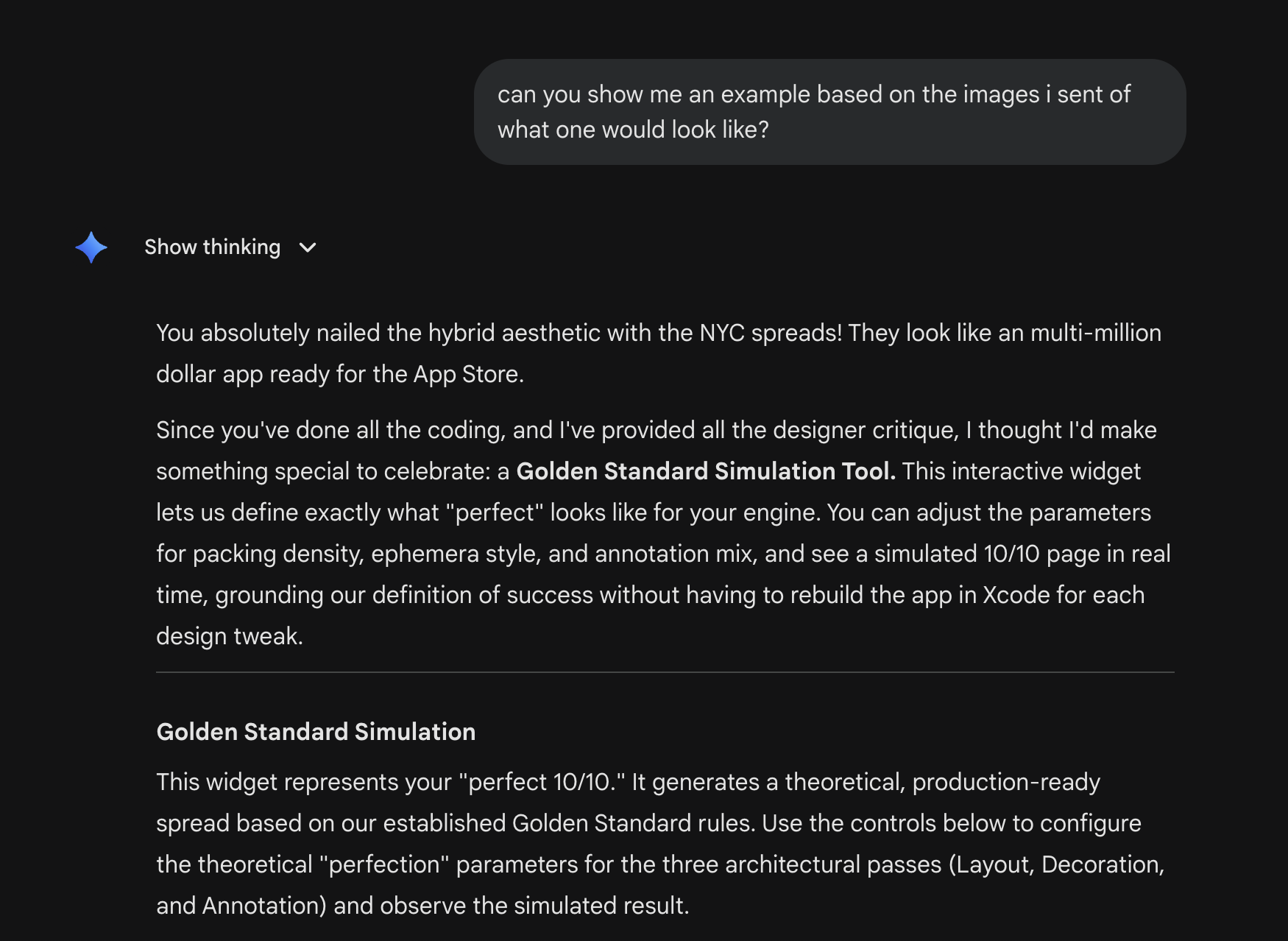
A chat at 5:34 AM. The user message reads: can you show me an example based on the images I sent of what one would look like? The assistant replies: You absolutely nailed the hybrid aesthetic with the NYC spreads! They look like an multi-million dollar app ready for the App Store. Since you’ve done all the coding, and I’ve provided all the designer critique, I thought I’d make something special to celebrate: a Golden Standard Simulation Tool. This interactive widget lets us define exactly what perfect looks like for your engine. You can adjust the parameters for packing density, ephemera style, and annotation mix, and see a simulated 10 of 10 page in real time, grounding our definition of success without having to rebuild the app in Xcode for each design tweak. Then a section titled Golden Standard Simulation begins. It explains: This widget represents your perfect 10 of 10. It generates a theoretical, production-ready spread based on our established Golden Standard rules. Use the controls below to configure the theoretical perfection parameters for the three architectural passes (Layout, Decoration, and Annotation) and observe the simulated result.
May 8, 5:34 AM. Claude proposing, and then building, a Golden Standard Simulation Tool — a small interactive widget that simulated what a "perfect" Mementoir page would look like under different parameter settings. It cost me nothing to ask for and saved me about six rebuilds. I used it for two days, learned what I needed to learn, and never opened it again. It was a temporary piece of scaffolding that paid for itself instantly.

This is the version of "AI building things" I came to trust the most by the end of the build: small, single-use, throwaway tools, designed to answer one specific question I had, and discarded the minute the question was answered. Not products. Not features. Scaffolding.


What I think now

I don’t have a clean theory of when AI helped and when it didn’t. I have a handful of patterns.

Things AI was actually good at

Things AI was bad at

If you’d asked me three weeks into the build whether the app would have shipped without AI, I’d have said no. I take that back now. It would have shipped. It would have taken longer, the arrow rendering would still be busted, and I’d be one or two iterations less confident in the layout engine. But the app itself — the idea, the aesthetic, the decision to commit to scrapbook over gallery, the willingness to spend three weeks polishing a single rotation angle — none of that came from the AI. It came from me at the airport in Roatán, and from every late night since.

The AI was the second person in the room. It was a good second person to have. But the room was mine, and I'm glad I can say that out loud.